
Howard Harris
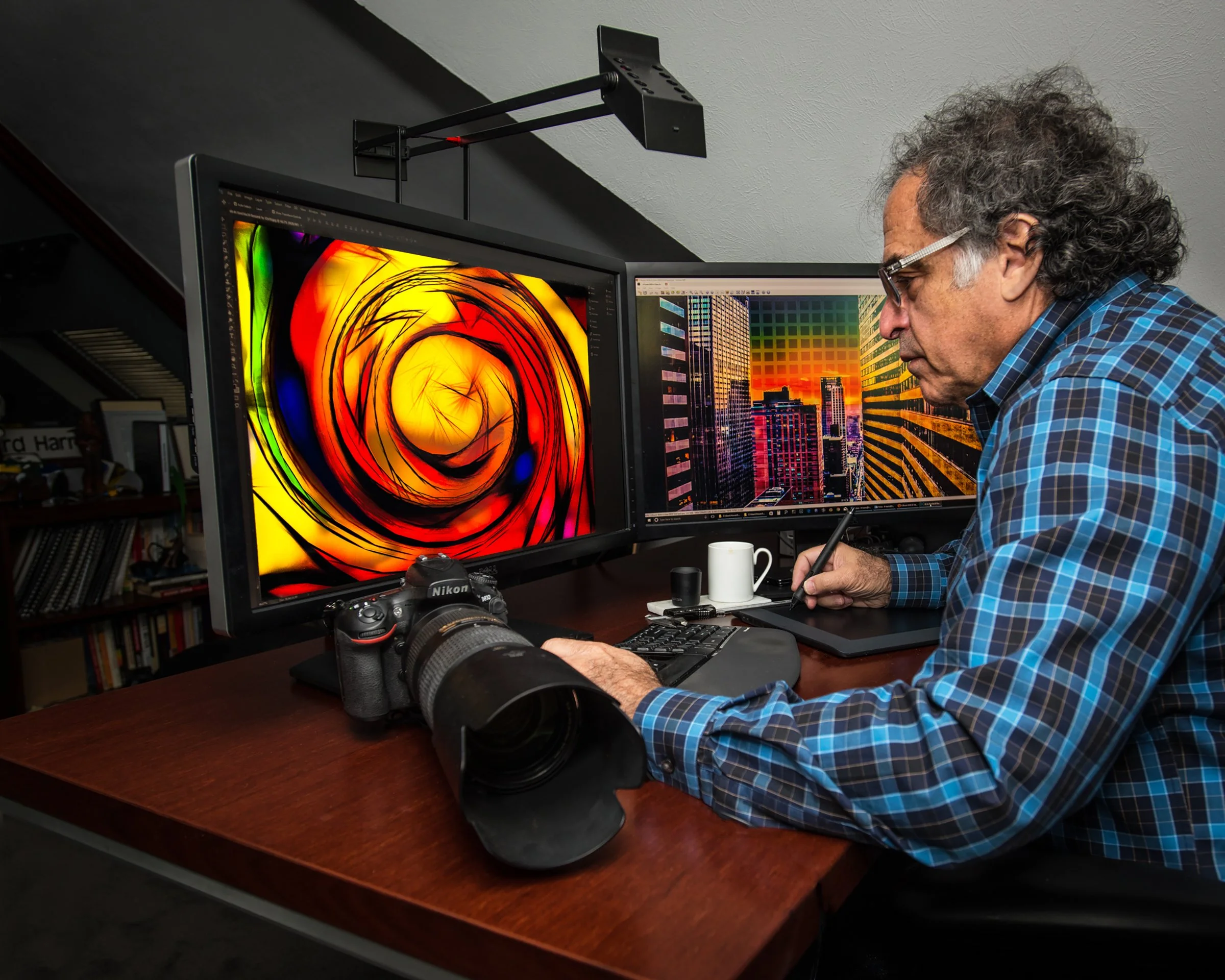
Howard Harris is a Techspressionist artist who has long been fascinated by visual perception and design. The Denver, Colorado, USA native earned a BFA from Kansas City Art Institute and a Master's in Industrial Design from Pratt Institute in New York. Harris has spent over 35 years combining design and technology, winning many prestigious professional awards. Now, his creative energy has turned to his lifelong passion, photography, and he was granted a United States Patent for his Photographic presentation. Since then, his work has appeared in numerous books and publications, including The Effetto Arte Foundation’s Fifty Talent Masters Artists to Collect, ARTtour International Artists of the Decade, Contemporary Art Curator Magazine's Art Leaders of Tomorrow: Defining the Future of Art, International Contemporary Masters, and Top 10 Contemporary Artists, among others. He has also been awarded the Artists for a Green Planet Artist of the Decade, the International Prize Raffaello, the International Prize Giulio Cesare, the International Prize Leonardo Da Vinci, and the International Prize Caravaggio, among others. He served as a trustee of The Kansas City Art Institute and was honored with the Who’s Who Worldwide Lifetime Achievement and the USA Small Businessperson of the Year awards. His work is exhibited internationally and represented by galleries in the United States, the U.K., and Europe.
Howard, in the works gathered in ICON, one encounters an insistence on the image as an unstable perceptual event rather than a fixed representation. Could you speak about how your layered constructions challenge the classical photographic index, and whether you see Techspressionism as a critique of the camera’s historical claim to objectivity?
When I speak of layered constructions, I mean images built from a photographed base that are then deliberately overlaid, remapped, or physically altered. The altered image enables a single fixed moment to present as an ongoing perceptual event. These procedures make visible the gap between a camera’s raw capture and the full, lived experience of seeing: memory, affect, display conditions, and allow individual perceptions to become part of the picture rather than the picture being just in the viewing background.
Your statement proposes visual reality as an ever-shifting synthesis of inner state and external stimuli. How does your process of superimposed grids and layered transparencies function as a structural analogue to that psychological and perceptual instability?
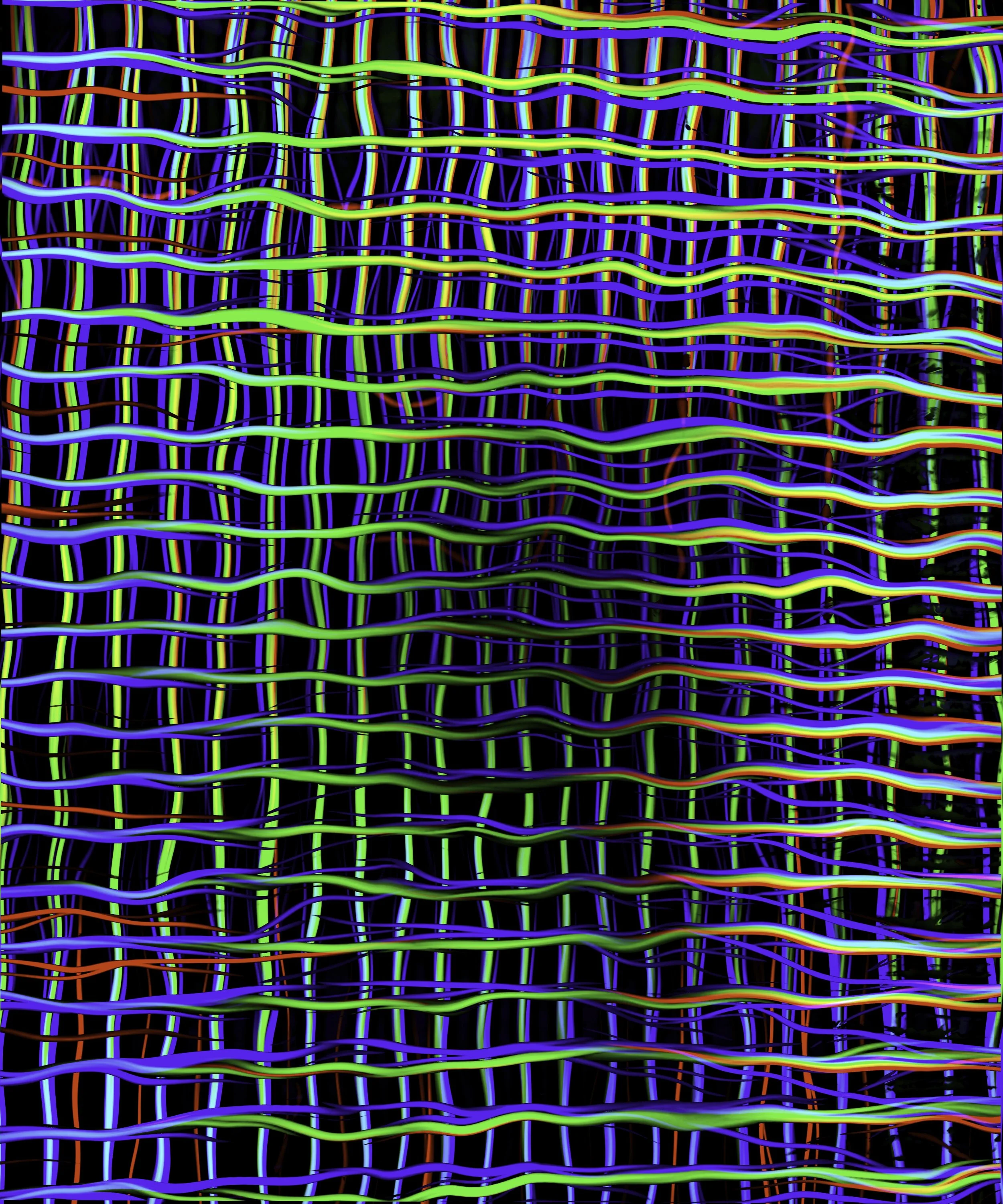
I print the grids on the reverse side of the acrylic and place them above a sublimated background image, creating four visual planes that the viewer must look through. The grids are constructed from a slightly altered positive/negative pattern whose spacing and the acrylic’s thickness produce a measurable parallax. This layered parallax shifts the apparent position of foreground elements relative to the static background as the observer moves, amplifying depth cues and perceived motion. Those perceptual effects interact with each viewer’s internal state—expectations, memory, and emotion—and with external factors like lighting and viewing distance, so the same object can appear different from moment to moment and from person to person. In this way, the physical structure of superimposed grids and transparencies becomes an analogue for the ever-shifting synthesis of inner state and external stimuli.
In the ICON publication, the text describes your images as an “optical dance that never settles,” a phrase that suggests both Op Art’s retinal agitation and a phenomenological encounter with the object. To what extent do you situate your work within the legacy of artists such as Albers or Vasarely, and where do you consciously depart from them?
I situate my work in the lineage of Albers and Vasarely: from Albers I take the concern with perceptual relativity—how color and adjacency alter seeing—and from Vasarely the interest in geometry and optical activation of the viewer. I depart consciously in method and intent. Rather than limiting myself to pigment or hand-made geometry, I work with layered acrylic, printed transparencies, and digital processes that introduce controlled parallax, emotional variability, and context-dependent effects. Where Albers explored relative color in controlled, static studies and Vasarely focused on pure geometric optical systems, my work embraces variability—viewer movement, lighting, and technological media become integral, and expressionistic gesture is allowed to shape the optical field. In short: I inherit their perceptual agenda but extend it through material-technique and a more subjective, techspressive purpose.
Your dimensional photographs seem to hover between image and object, between representation and construction. Would you say that your practice attempts to collapse the distinction between sculpture and photography, or does it propose a third category altogether?
I see the work as sitting between camps, not strictly in one. I treat photographs as made objects—layers of acrylic, printed transparencies, and digital processes—so they read as pictures while also demanding a physical, spatial experience. Rather than merging sculpture and photography into a single form, the pieces play with both: you look at an image and move around an object simultaneously. The result feels like a hybrid: a photographic object whose meaning comes from both seeing and being with it. Practically, that means I design for both pictorial reading and variable viewer interaction. The works retain photographic framing and visual content but must be experienced as objects in time and space—depth, parallax, lighting, and viewer position become compositional variables. Ultimately, the goal is not to eliminate categories but to expose their dynamic tensions, as my work continually negotiates image and object, representation and construction.
The grid in your work recalls the modernist grid as a symbol of autonomy and flatness, yet in your constructions, it becomes a device for depth, parallax, and movement. How do you reconcile this inversion of one of modernism’s most canonical structures?
I know the grid is famous in modern art for making pictures flat and “pure.” I use that idea on purpose, but I change how it works so it creates depth and movement rather than only flatness.
How I do it:
• Layers and shifts: I stack and offset parts of the grid so it reads like different planes. As you move, the grid lines up and falls apart, creating depth and parallax.
• Repetition and small changes: Repeating lines, colors, or spacing but tweaking them slightly makes the eye move across the work, so it feels like time or motion.
• Using the grid as a rulebook: I treat the grid as a tool, not a law. The rules give structure but also open up new possibilities.
So the grid is still there and recognizable, but I turn its idea of “flatness” into something that moves and has space. However, to be honest, using the grid sometimes just doesn't work. It does not create the effect I am trying to achieve, so some of my works do not use the grid. And then some of my work only uses the grid in specific areas, giving the image both static and dynamic qualities.
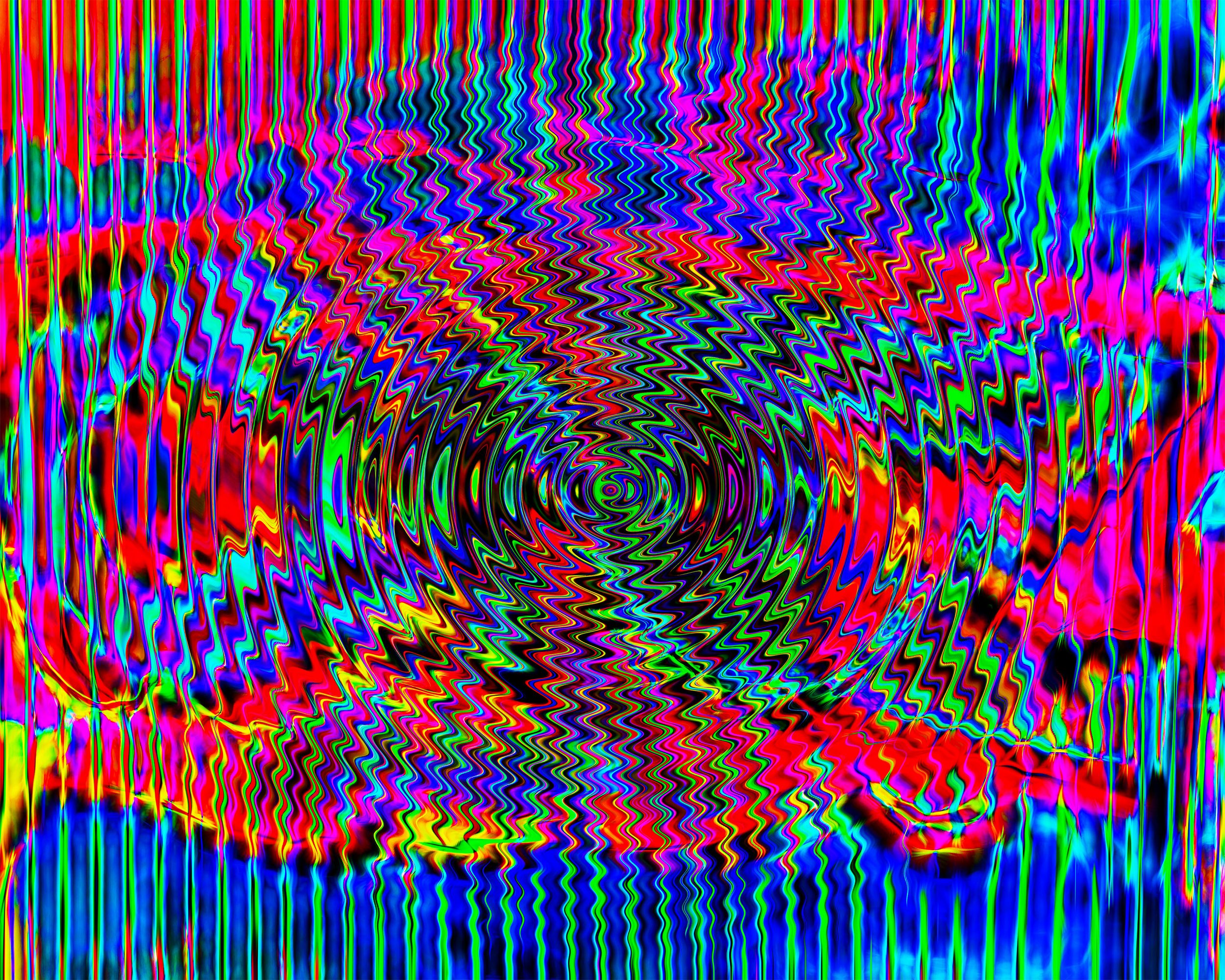
In pieces such as Midcentury Modern and Play It Again, the surfaces appear to vibrate with chromatic tension and spatial ambiguity. Are these works conceived primarily as perceptual experiments, or do you see them as carriers of cultural or historical memory as well?
I see those works as both perceptual experiments and carriers of cultural memory. I’m very interested in how color, contrast, and composition make the eye vibrate and shift. The visual tension and ambiguous space are meant to make viewers notice their own seeing and how small changes alter depth and movement. As for cultural and historical memory, the titles, shapes, and colors echo midcentury design and popular visual culture. That reference brings in ideas about taste, nostalgia, and how certain styles carry social meanings. So, these images use perceptual effects to activate memories and associations. They make you see, remember, question, or feel the cultural history behind the forms.
Your training under Rowena Reed Kostellow placed a strong emphasis on the formal relationships between line, plane, and volume. How does this modernist design pedagogy inform the compositional logic behind your layered photographic structures?
Gail Greet Hannah wrote in the introduction to the book about Rowena Reed Kostellow’s teaching, “Elements of Design,” that “Computer-aided design was on the horizon by the end of Rowena Reed’s life, although it had yet to transform design practice in the way we now take for granted. She was especially concerned about the impact of the computer on the practice of three-dimensional design and cautioned against using the computer to do things that she believed only the human eye and hand could do. It now remains for those who value her approach to design education to make the intellectual leap and to devise new ways to integrate these new opportunities and new models of expression within the traditional 2-D/3-D creative process”.
I can’t say it any better than Gail Hannah. When studying with Rowena, my job was to teach her computers and their capabilities, and her job was to teach me the spiritual language of humanity within design. Now her concepts and teachings come as naturally as breathing. My layered photographic structures highlight one of her overriding precepts that all three-dimensional design must be a surprise or be visually different to the viewer at every viewing angle. I believe I have respected her teachings by using layered structures rather than a predictable, static photographic image.
You have spoken about the momentary blindness you experienced as a teenager and its lasting influence on your fascination with sight. How has that biographical rupture shaped your understanding of vision not as a given, but as a constructed and fragile phenomenon?
Looking back, I realize that I have long been fascinated by both visual perception and design. This fascination likely began after I regained my sight following a traumatic accident when a model rocket engine exploded in my face, leaving me blind for several months. That event shook my expectation that being able to see is not a given. It’s a gift not to be squandered. At that early age, I was reading every philosopher I could think of, from Plato and Aristotle to Nietzsche and Sartre. That’s when I first realized sight is very different from vision. Then, through my formal education at the Kansas City Art Institute with George Burris and at Pratt Institute with Rowena Kostallow, and through my studies in Eastern Philosophy at Pratt, my mind became a vibration of what exactly site, vision, and art are. Very much later, I was able to articulate my experience by realizing that life gives you eyes; art lets you see with your mind what cannot be seen with your eyes.
The ICON text suggests that the viewer’s perception completes the artwork, producing a personalized interpretation of depth and motion. Does this participatory aspect align your practice more closely with phenomenological sculpture than with the traditions of photography?
Finally, an easy question to answer. The answer is YES! If someone doesn’t know what phenomenological sculpture is, as I didn’t, here is an AI-generated overview: Phenomenological sculpture is an art form that prioritizes the viewer's direct, sensory experience and bodily engagement over traditional representation or symbolism. Often associated with minimalism, these works use simple forms, materials, and light to heighten awareness of space, time, and the viewer's presence.
Techspressionism, as you describe it, merges expressive intent with technological mediation. How do you respond to the long-standing suspicion in art discourse that technology distances the artist from the hand, and therefore from authenticity?
That question sets up a false choice between “the hand” and “the machine.” Techspressionism treats technology as an extension of the artist’s body and mind rather than a substitute. Tools have always been used in the arts, the paintbrush, the camera, the lathe, etc., but what matters is intention, decision-making, and the artist's embrace. Digital systems introduce new forms of gesture and new artistic limitations. I believe technology can heighten rather than dilute creativity/the arts by enabling new modes of risk and improvisation. In short, art still resides in the choices, failures, edits, and aesthetic judgment of the artist, not in whether a tool is mechanical or manual. Techspressionism only expands the meaning of “the hand” in today's artistic world.
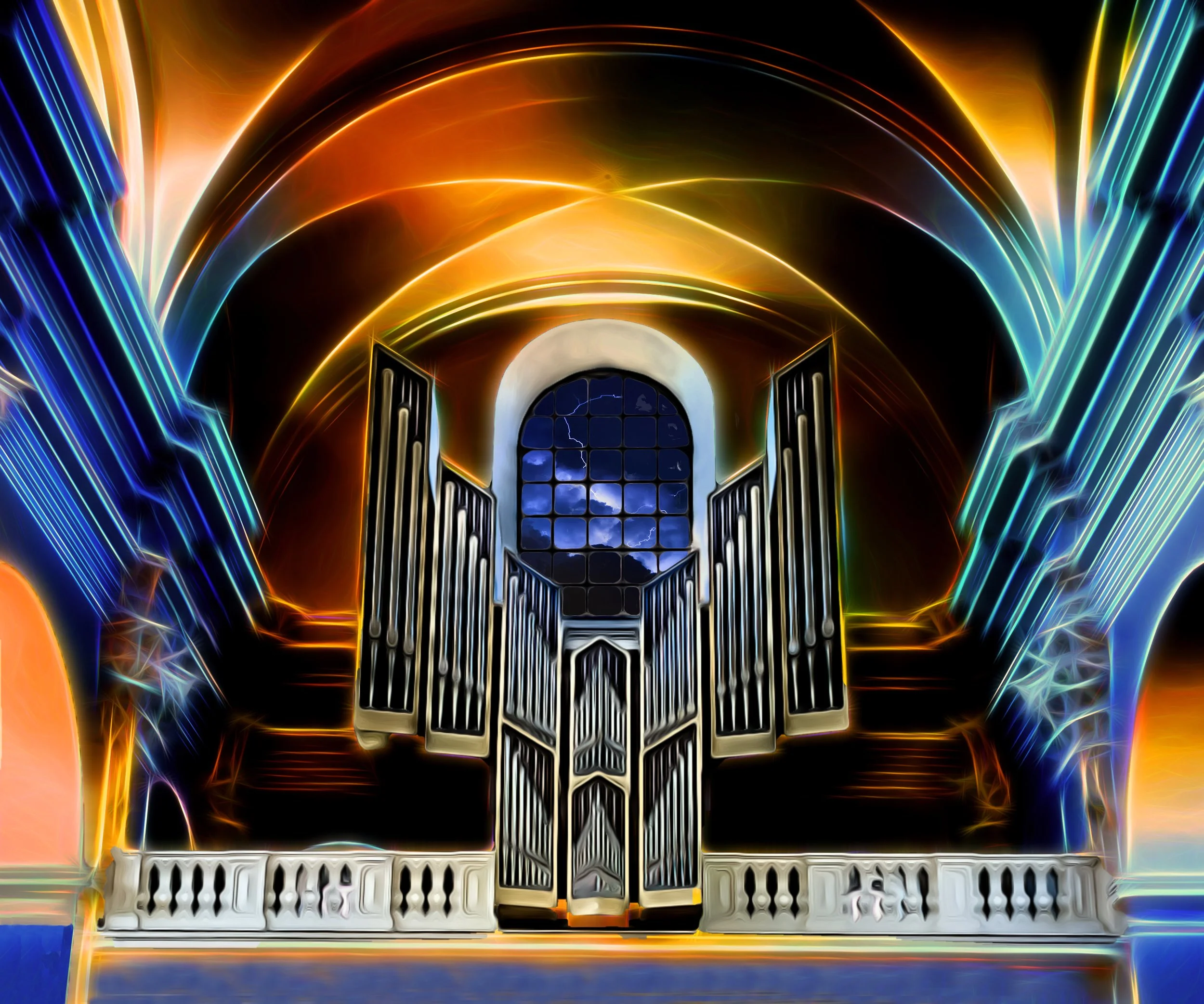
Your process involves sublimation printing on aluminum, ultraviolet grids on acrylic, and layered optical effects. At what point does the technological apparatus cease to be a neutral tool and become, instead, the conceptual core of the work?
The technology I use moves between tool and idea depending on my intention or situation. Sublimation printing, UV grids, and layered optics are just methods to realize a photograph or memory; they’re just tools. But when those processes shape the meaning, reveal new visual realities, or become the reason I make the image, they become integral to the concept itself. I aim for beauty and emotional impact first. If a grid or optical layer distracts from the memory I want, I drop it. If a technological effect transforms the image in a way that deepens my idea/emotion, by fracturing, intensifying, or colorizing the memory, then the technology is at the heart of the work. In short, technology is neutral until only my choices make it meaningful.
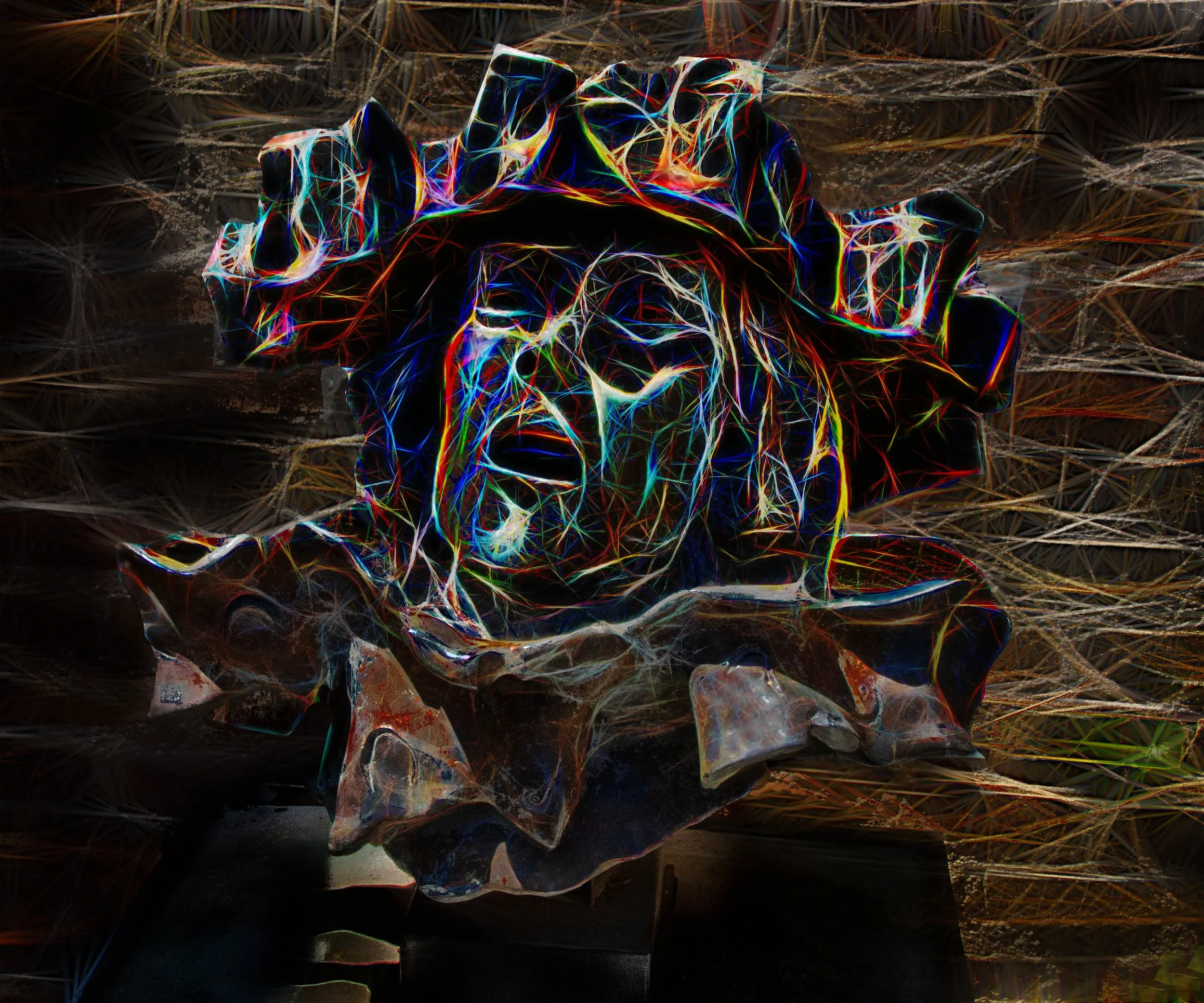
Many of the works in ICON evoke natural phenomena, storms, animals, and fruit, yet they appear radically abstracted. How do you negotiate the tension between the referential image and the autonomous field of color and form?
Most often, I don’t try to force a compromise between reference and abstraction; I begin with the referential image and let the camera’s pixels and my digital process transform that material into a field of color and form. My choices of cropping, color extraction, layering, and texture manipulation determine how much of the original subject remains legible. Sometimes I retain hints of storm, animal, or fruit; other times I deliberately erase them so the work reads as pure color and form. In that sense, I follow Paul Klee’s idea that art “makes visible” inner realities rather than reproducing the visible. For example, in ICON, Apple's image started with a photograph of an apple tree, but stripped away its outline through saturation and brush-mapped pixels until only a red field suggested the fruit’s presence, while keeping the tree reference through the leaves.
You often speak of the image as something that “reveals itself” over weeks or months. Could you elaborate on this temporal dimension of your process, and whether the duration of making parallels the temporal instability experienced by the viewer?
The temporal dimension of my process is integral: while the shutter click marks a discrete moment of capture, the image truly reveals itself over weeks or months as I revisit the file, experiment in Lightroom and Photoshop, and layer alternative treatments of line, volume, and color to reveal emotional possibilities. Digital tools enable many reinterpretations of cropping, color extraction, and texture blending, so a single photograph can reveal multiple layers of interpretation. That slow unfolding mirrors the viewer’s experience: as the eye follows shifts in color, form, and depth, what seemed stable becomes unstable, and hints of referent (storm, fruit, animal) may appear, recede, or transform. For example, Brisbane Storm began as a simple coastal study; after months of alternating saturation passes and layer blending, the reference dissolved into a luminous field whose suggested horizon produces a fleeting sense of motion.
The text in ICON emphasizes your ability to balance chaos and order with precision. Do you conceive of your compositions as governed by measurable systems, perhaps influenced by your engagement with data and technology, or are they ultimately intuitive structures?
My work begins with methodologies developed through years of training, technical practice, datasets, algorithmic processes, color-mapping routines, and compositional grids that impose measurable constraints. Those systems generate permutations and reveal formal possibilities, but the final decisions are governed by intuition: a sense of line, color, volume, and emotional resonance that overrides or refines what the data proposes. For example, I may use pixel-sampling algorithms to extract a palette and a grid to structure elements, then abandon or adapt those rules in the studio when a volume or color relationship feels more relevant to the feeling I want to present.
In your biography, design is described as “art that you do for others,” while your current practice is more autonomous. How has the shift from client driven design to self directed art altered your understanding of authorship and intention?
My core belief about authorship—design as a collaborative act—remains, but my working definitions have shifted dramatically. In commercial design, authorship was shared: clients, stakeholders, and market demands shaped the outcome, and my intention was to sell a product and satisfy the client. Now, working autonomously, I am the final judge (except for Michele, my wife); my intentions are driven by personal vision and criteria rather than commercial goals. This freedom is liberating and also more demanding, since I bear full responsibility for what is shown to the public."
Your work frequently references quantum physics, chaos theory, and perceptual science. Are these frameworks primarily metaphors for artistic thinking, or do they offer concrete structural models that shape your compositions?
While quantum physics, chaos theory, and perceptual science offer useful structural concepts, I ultimately treat them as metaphors that inform my artistic thinking. I studied them (along with fractals, fluid dynamics, and Eastern philosophies), hoping for a definitive methodology, but instead they became directional frameworks: they shape how I think about color, volume, and form without prescribing exact solutions. For example, fractal logic guides my approach to recurring patterns and scale, while chaos theory informs controlled unpredictability in composition.
In the ICON interview, you describe yourself as a conduit rather than a narrator, allowing each viewer to experience a different emotional response. Does this relinquishing of fixed meaning challenge the traditional notion of the artist as authorial voice?
My role as a conduit encompasses the viewer’s experience rather than imposing a single interpretation. By letting the photographed image resonate differently for each viewer, I deliberately give up a fixed meaning and undermine the idea of the artist as a singular authorial voice. The work functions as a prompt for personal response rather than a dictated narrative.
The dimensionality of your work depends on light, movement, and the viewer’s position in space. How important is the exhibition environment to the final reading of the work, and do you consider installation to be part of the artistic act?
The exhibition environment is crucial to how my work is read: light, movement, and the viewer’s position in space actively shape perception. A piece shown in an alley beside a trash can will provoke different associations than the same work in a museum, and the scale or reputation of a venue also changes the viewer's expectations. Because installation, placement, lighting, and the viewer's movement directly alter the work’s experience, I consider them integral to the artistic act and viewer’s experience.
Many modernist photographers pursued purity of medium, emphasizing the flat photographic surface. Your work, by contrast, seems to celebrate hybridity, layering, and material complexity. Do you see this as a post medium condition, or as an expansion of photography’s historical language?
I view my work as an expansion of photography’s historical language: layering, material complexity, and digital processes extend photographic possibilities rather than negate them. While some photographers resist these shifts, I see them as continuations and expanding the photographers’ methodologies and materials, not a rejection of the medium but its evolution."
As Techspressionism continues to evolve within your practice, what new directions, materials, or conceptual investigations are you planning to pursue in the coming years?
As Techspressionism evolves in my practice, I’ll pursue greater dimensionality through hybrid processes that combine computational imaging (AI-assisted compositing), old and new forms of printing on textured or translucent substrates, and sculptural framing that engages with light and viewer movement. Conceptually, I’m exploring perception and visual memory as to how images may alter emotional response. Eventually, I plan to create site-responsive installations that integrate projection, motion, and other elements I have yet to experience. Gorky’s idea of abstraction informs this inquiry: I use layered, imaginative forms to reveal mental landscapes the eye alone cannot see."
Website: www.hharrisphoto.com
Instagram: @howardharrisphotoart
Facebook: @howardharrisphotoart
LinkedIn: https://www.linkedin.com/in/howardharrisphotoart/
Window Wonder, 2022, Sublimation on Aluminum with Acrylic Overlay, 76x91 cm
No Monkeys, 2014, Sublimation on Aluminum with Acrylic Overlay, 76x91 cm
Miros Dream, 2018, Sublimation on Aluminum with Acrylic Overlay, 76x91 cm
Battle Cloth, 2019, Sublimation on Aluminum with Acrylic Overlay, 76x91 cm
Albers Unleashed, 2020, Sublimation on Aluminum, 76x91 cm
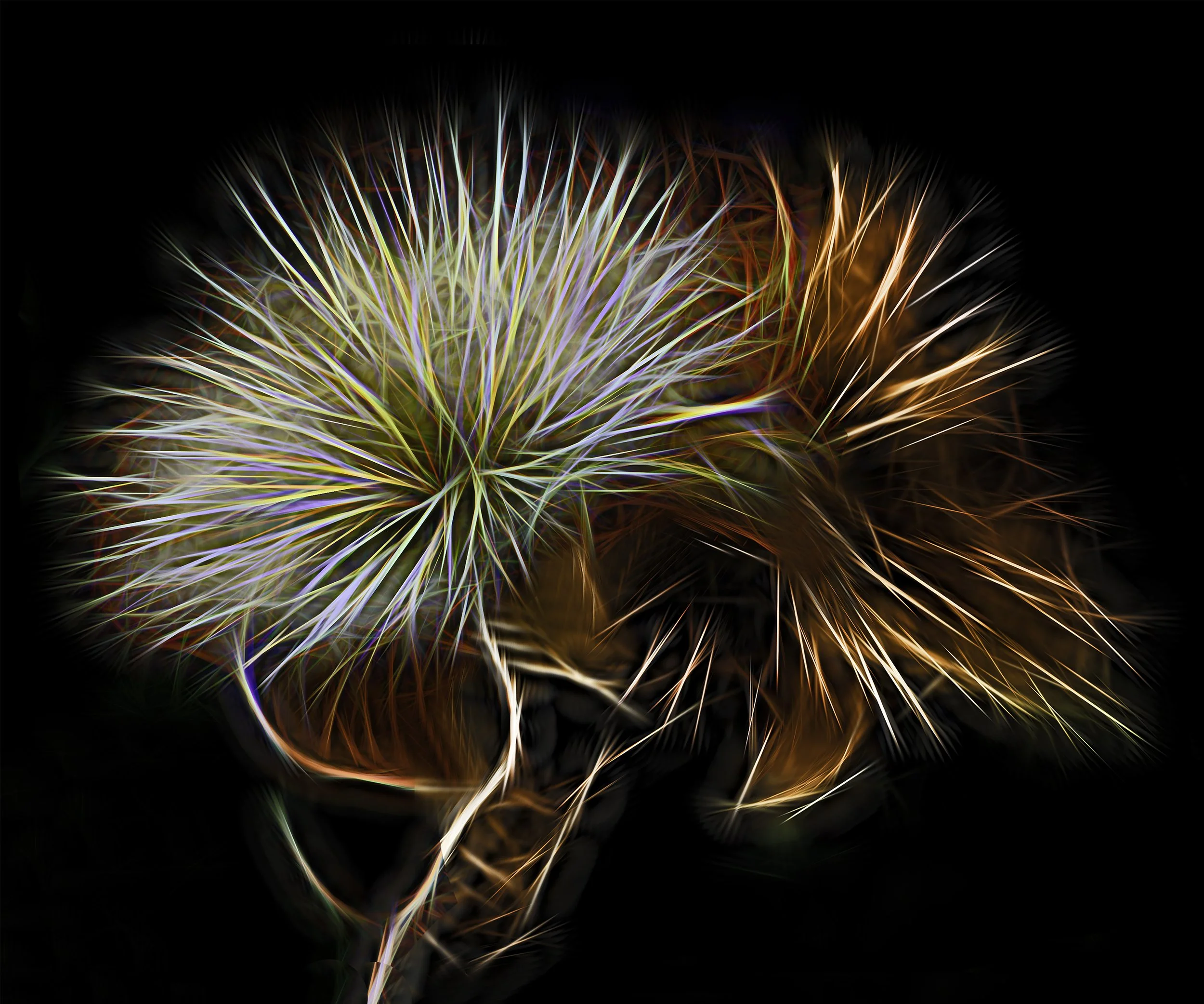
Puffer, 2019, Sublimation on Aluminum, 76x91 cm
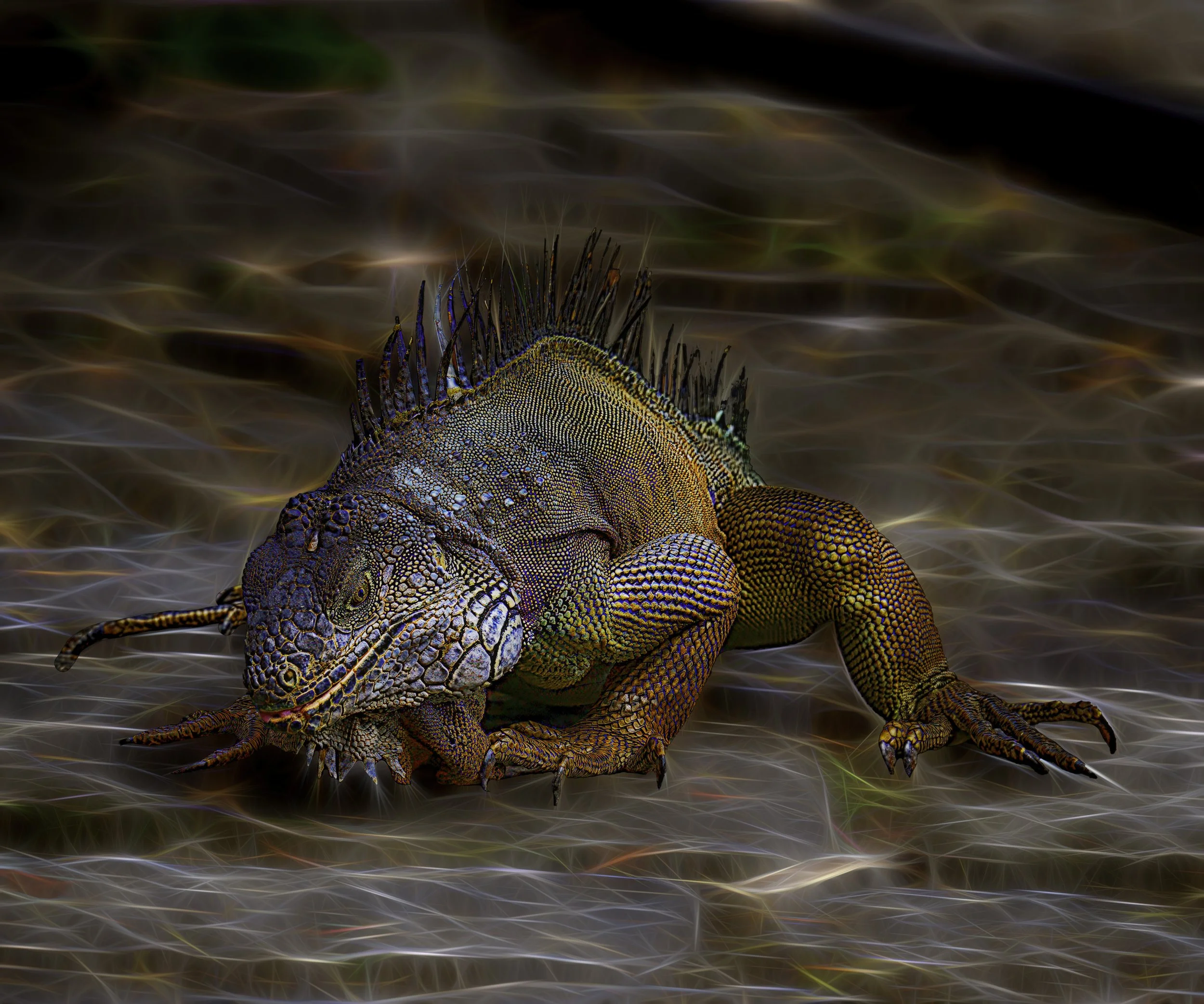
Iguana, 2025, Sublimation on Aluminum with Acrylic Overlay, 76x91 cm
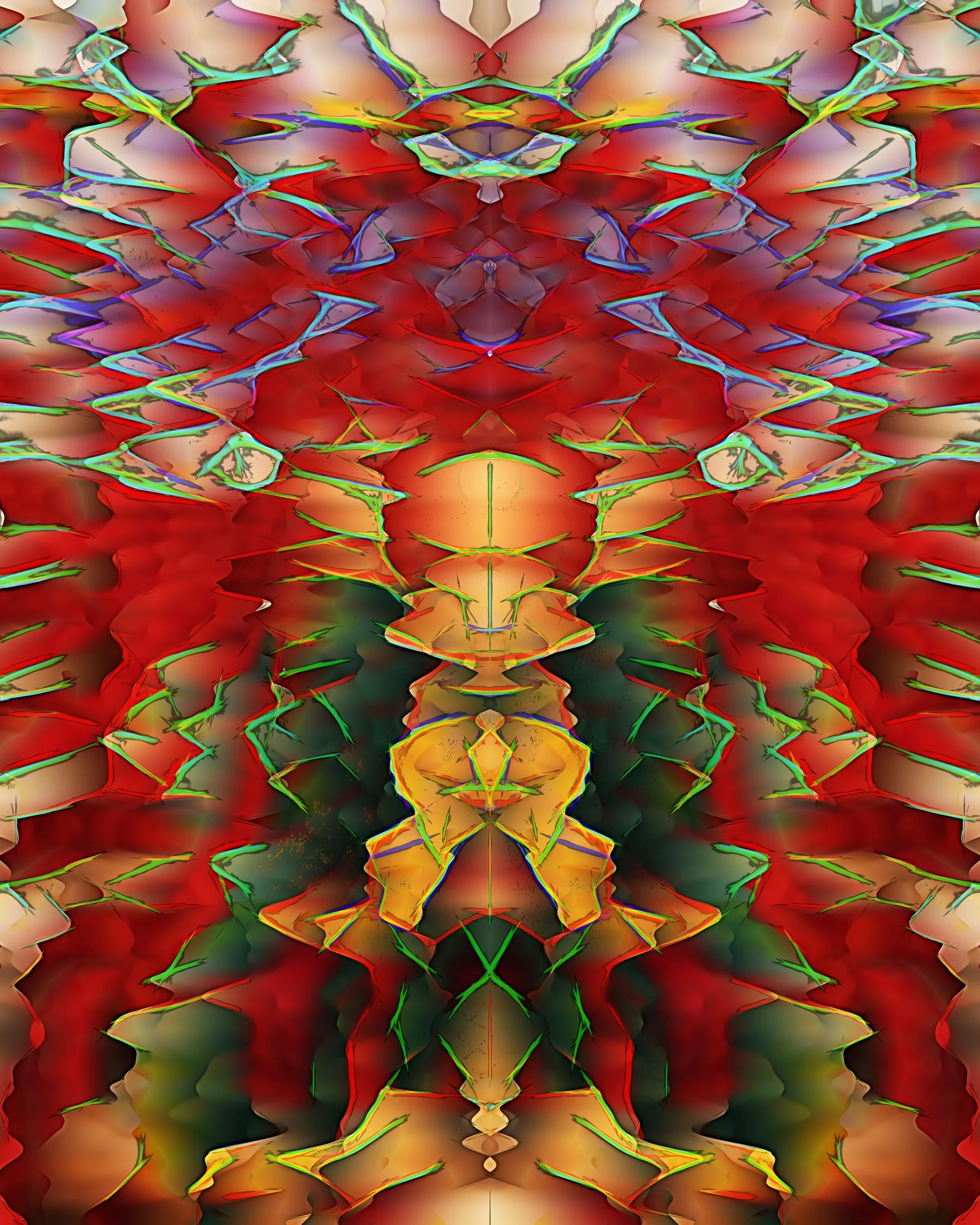
Play It Again, 2025, Sublimation on Aluminum with Acrylic Overlay, 76x91 cm
Graffiti, 2018, Sublimation on Aluminum with Acrylic Overlay, 76x91 cm
Tortured, 2023, Sublimation on Aluminum with Acrylic Overlay, 76x91 cm
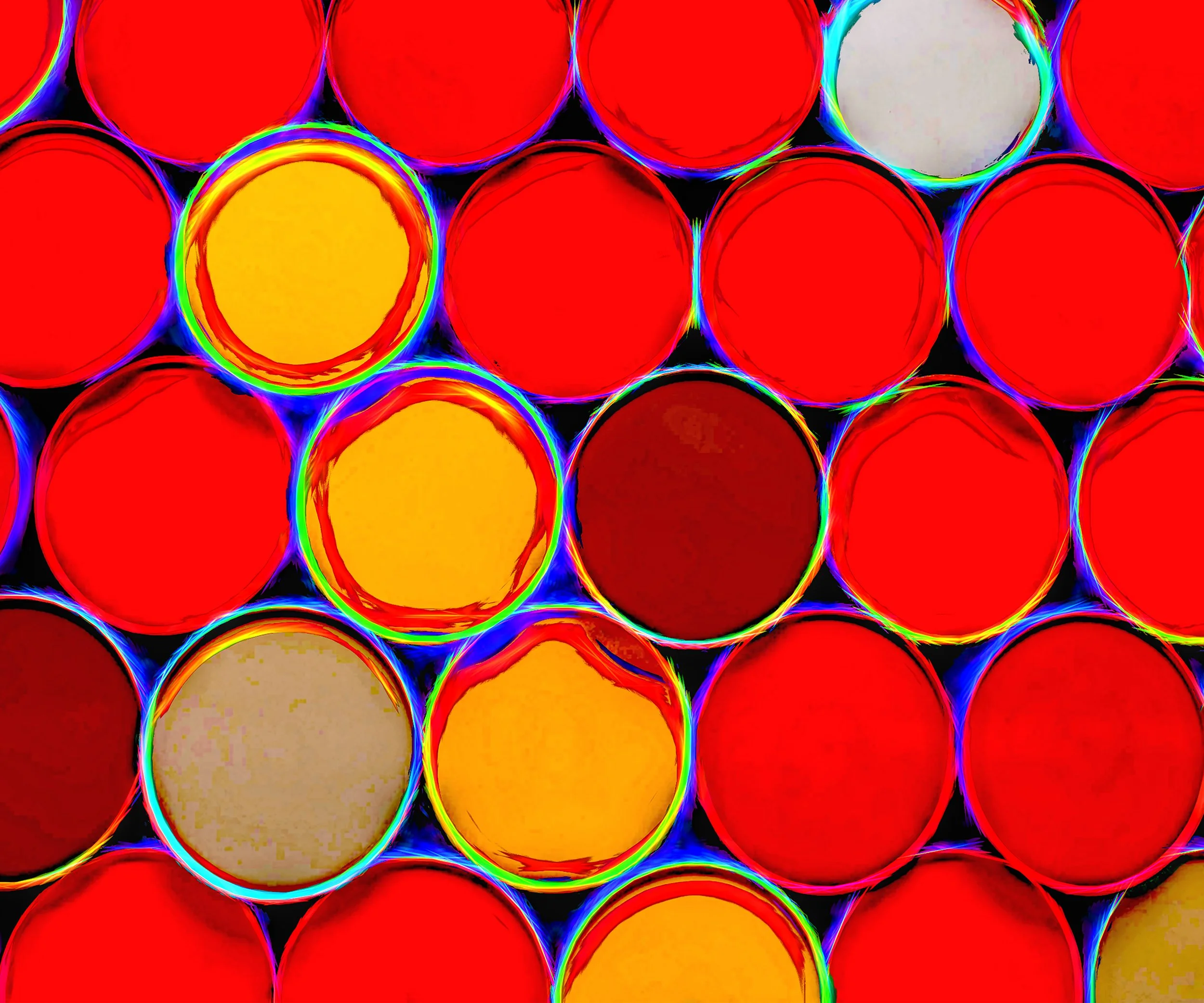
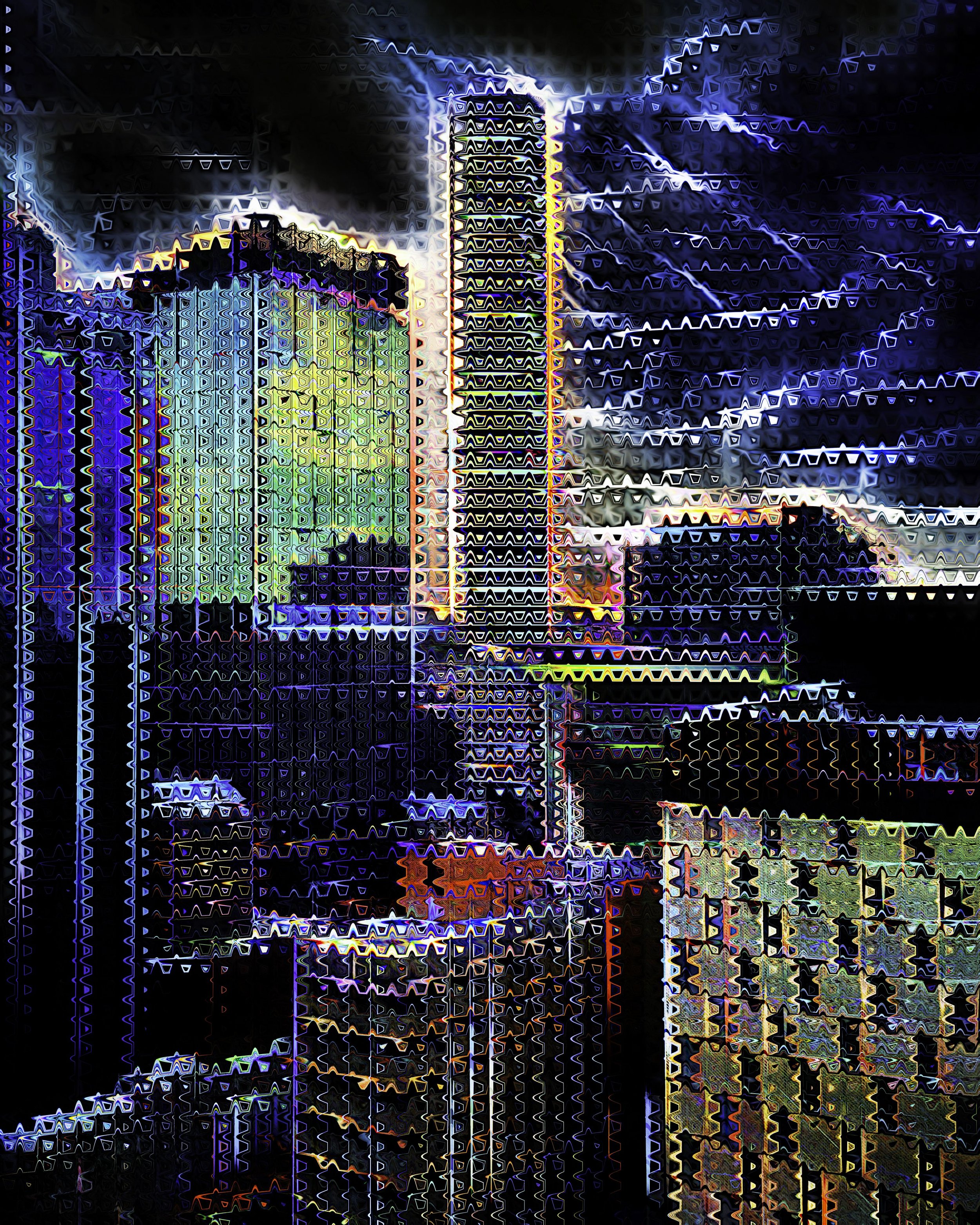
Thunder Pipes, 2021, Sublimation on Aluminum with Acrylic Overlay, 76x91 cm
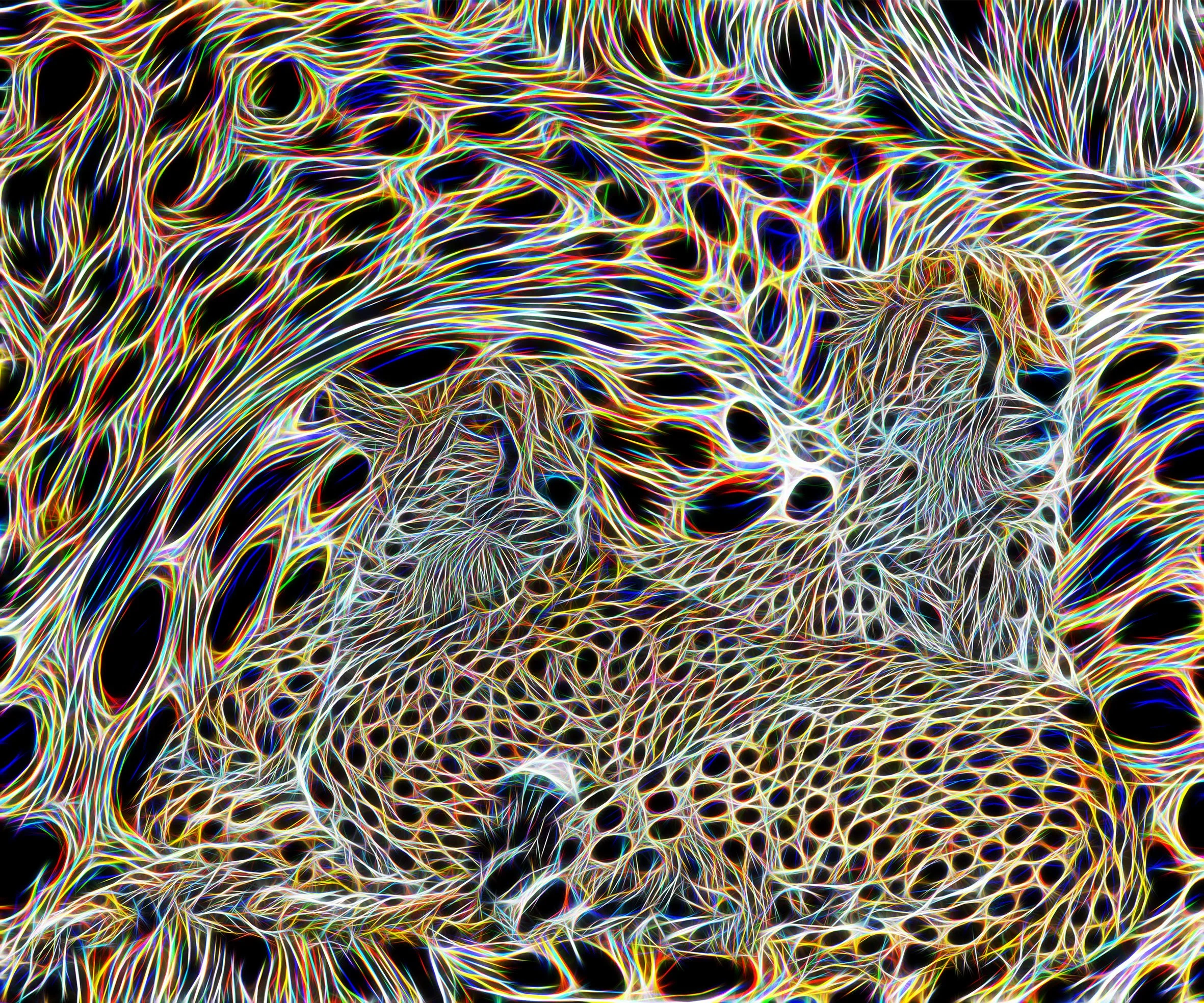
Cheetah, 2021, Sublimation on Aluminum with Acrylic Overlay, 76x91 cm
Brisbane Storm, 2021, Sublimation on Aluminum with Acrylic Overlay, 76x91 cm
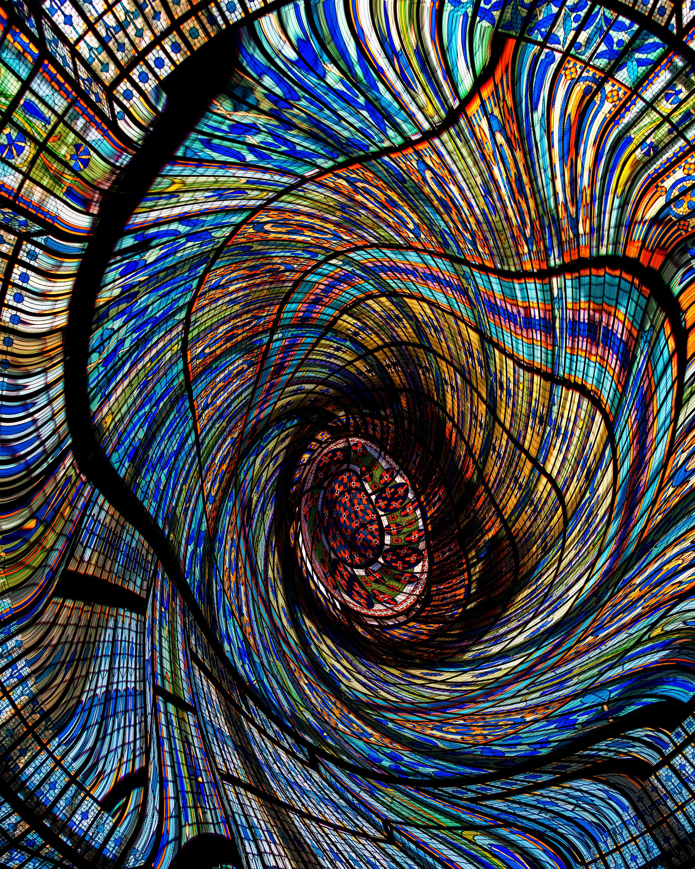
Skylight, 2014, Sublimation on Aluminum with Acrylic Overlay, 76x91 cm
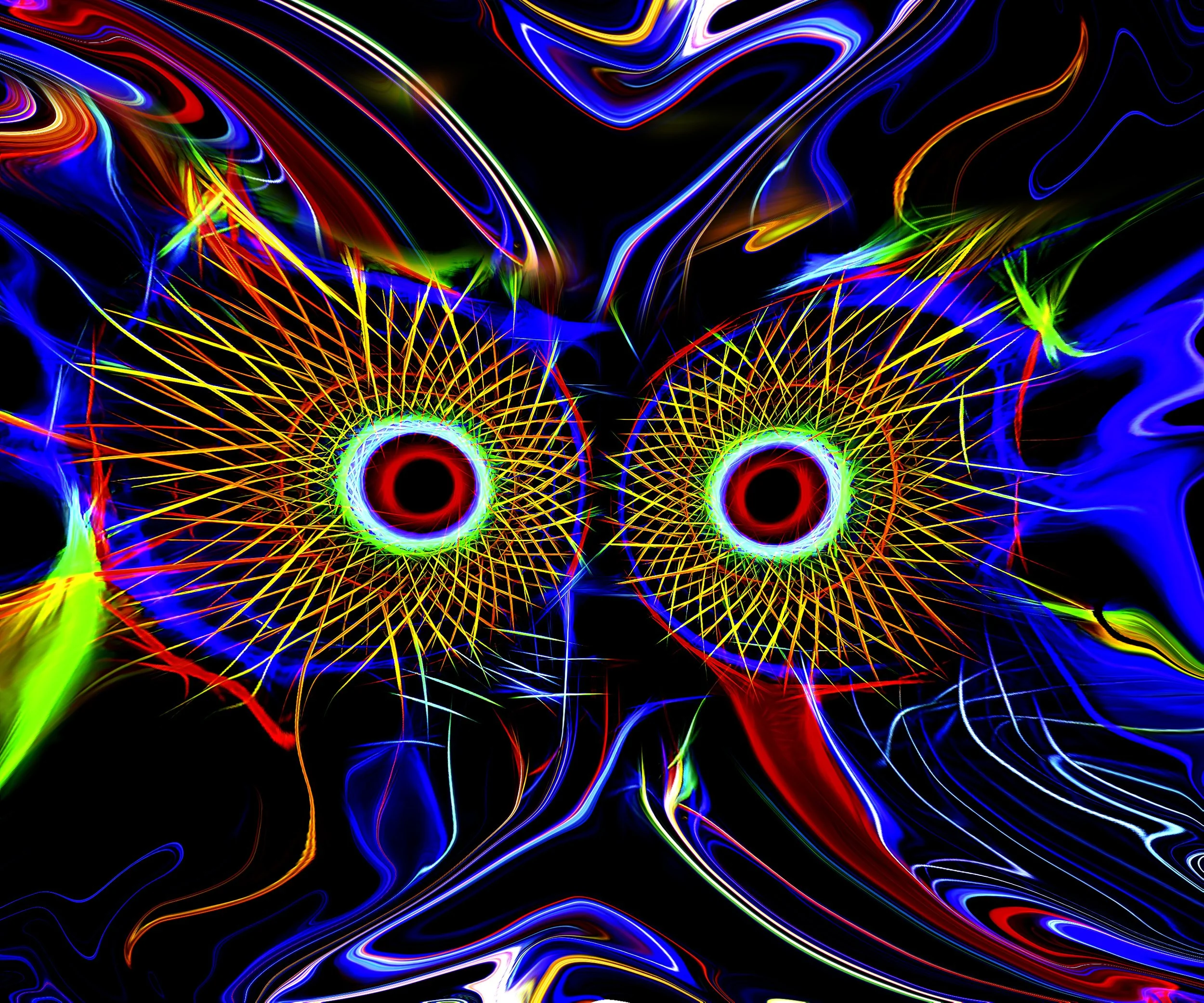
Whooo, 2023, Sublimation on Aluminum with Acrylic Overlay, 76x91 cm
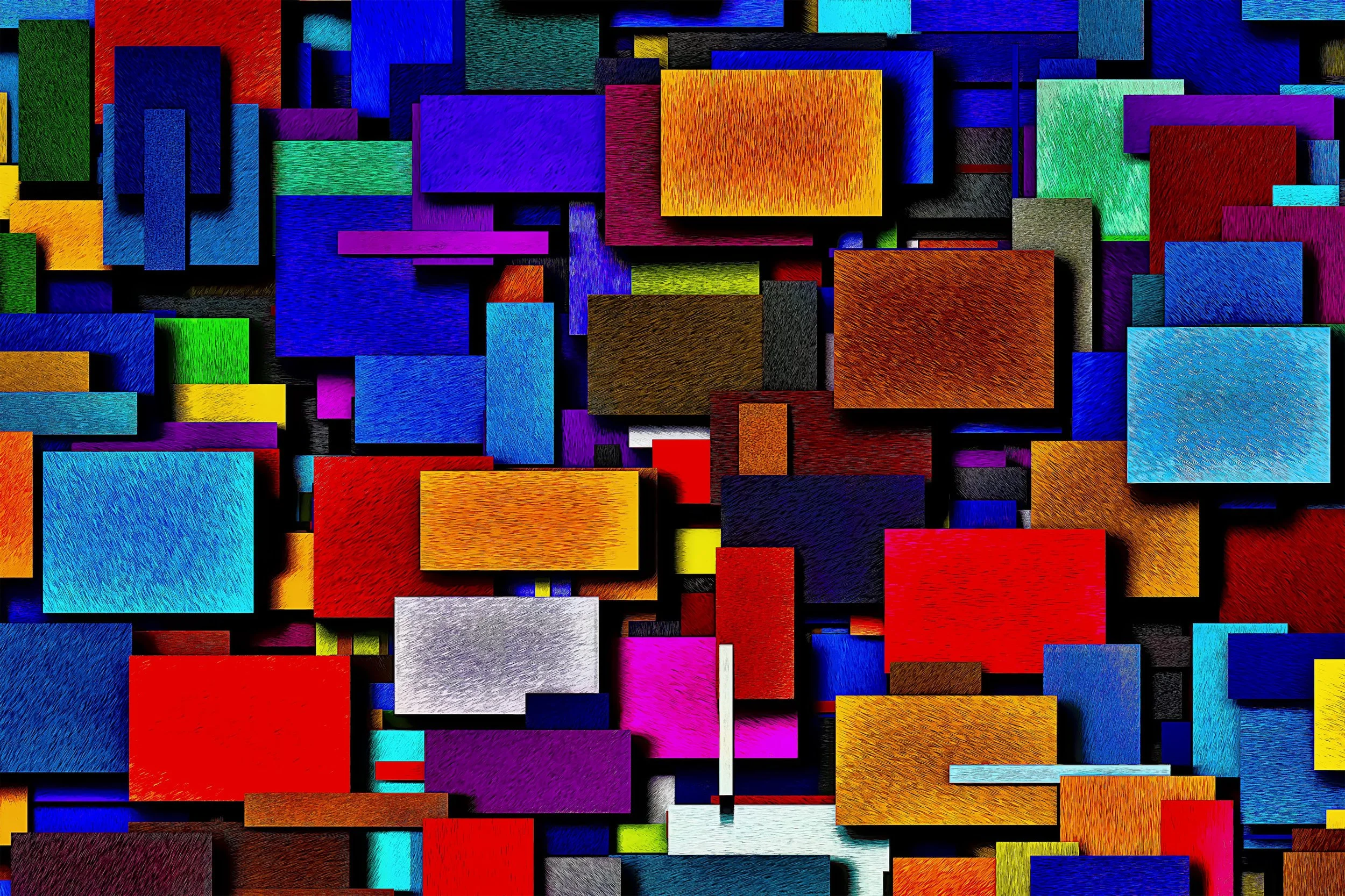
Midcentury Modern, 2025, Sublimation on Aluminum with Acrylic Overlay, 76x91 cm
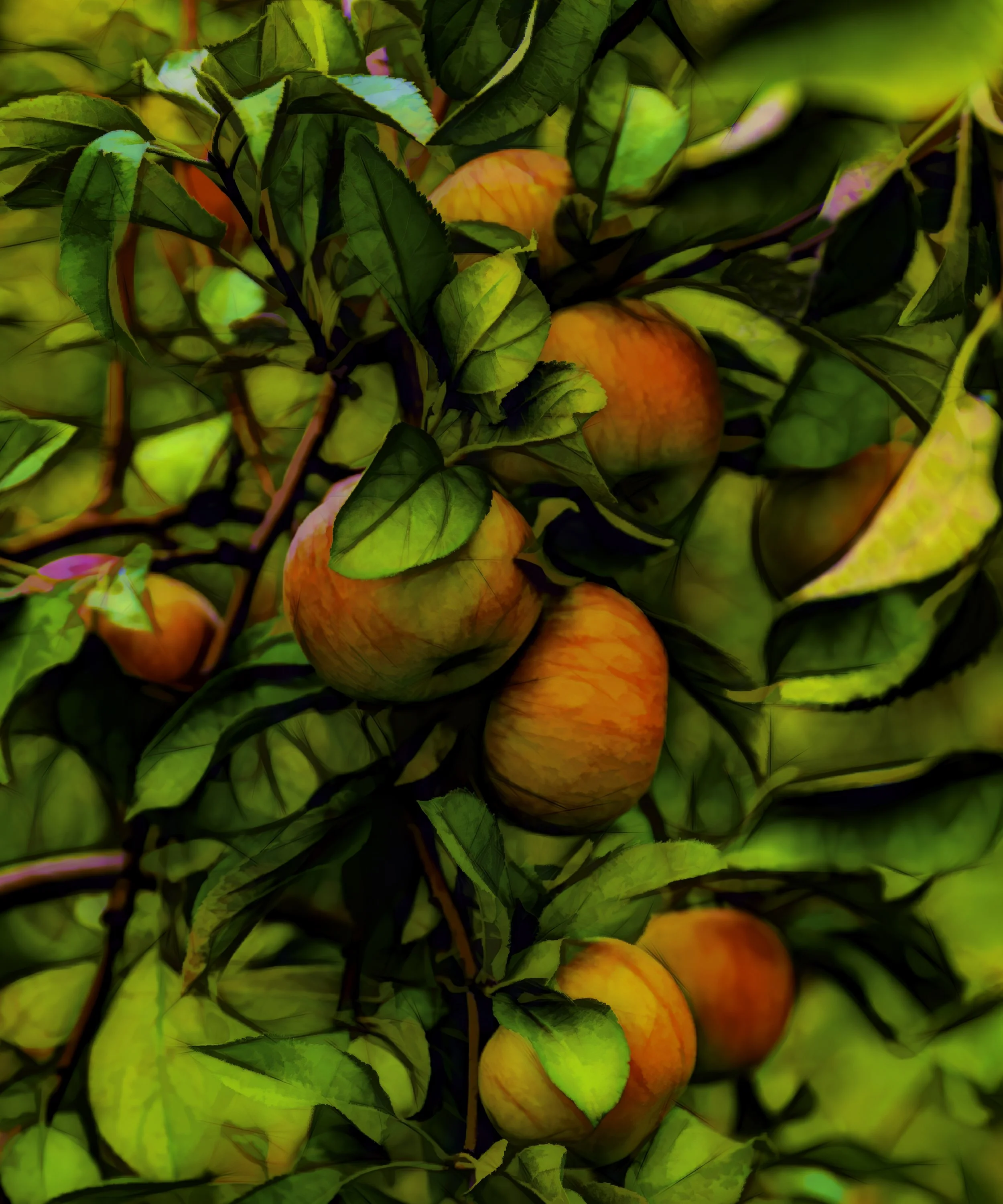
Apples, 2023, Sublimation on Aluminum with Acrylic Overlay, 76x91 cm
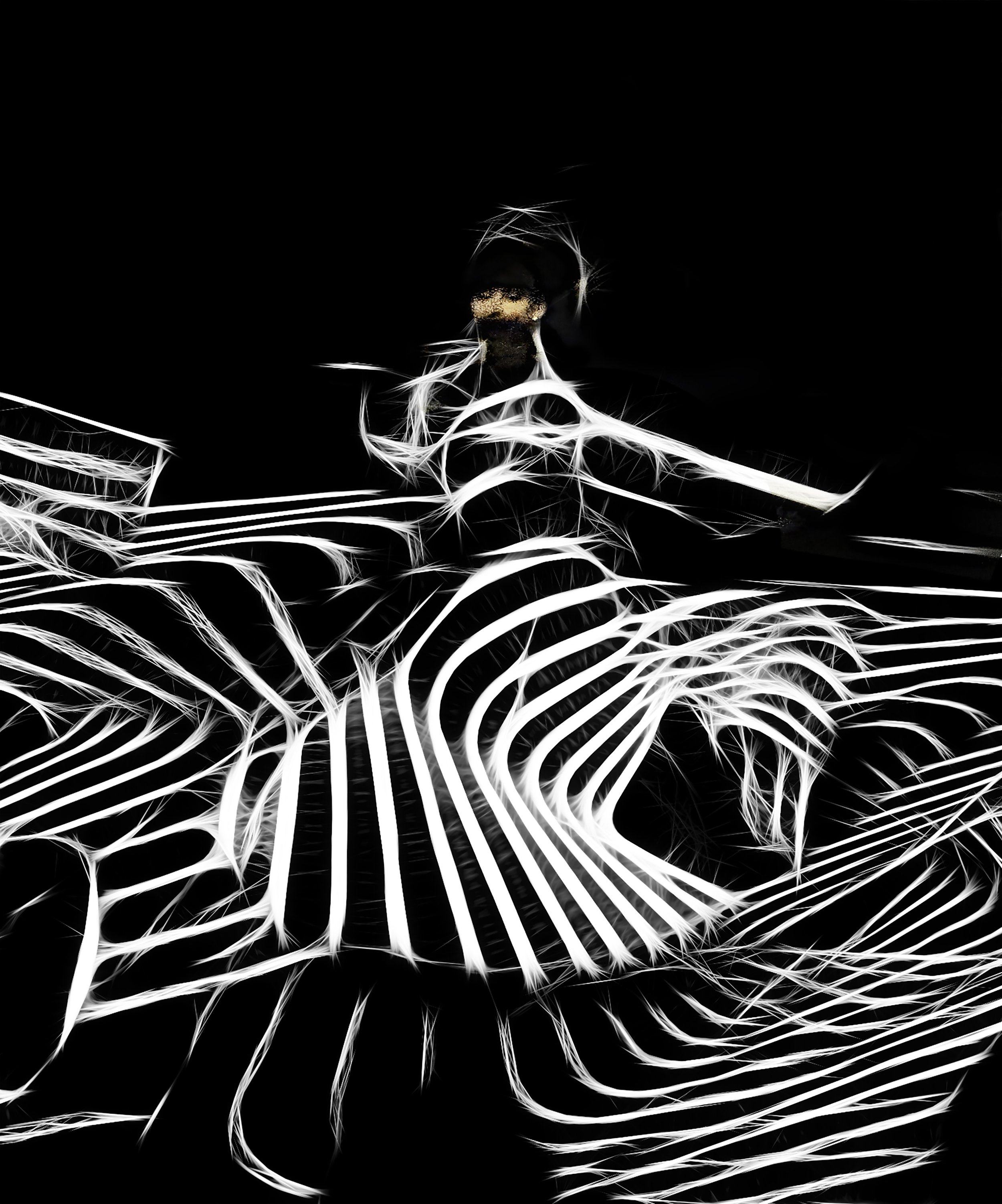
Dance of Light, 2024, Sublimation on Aluminum, 76x91 cm
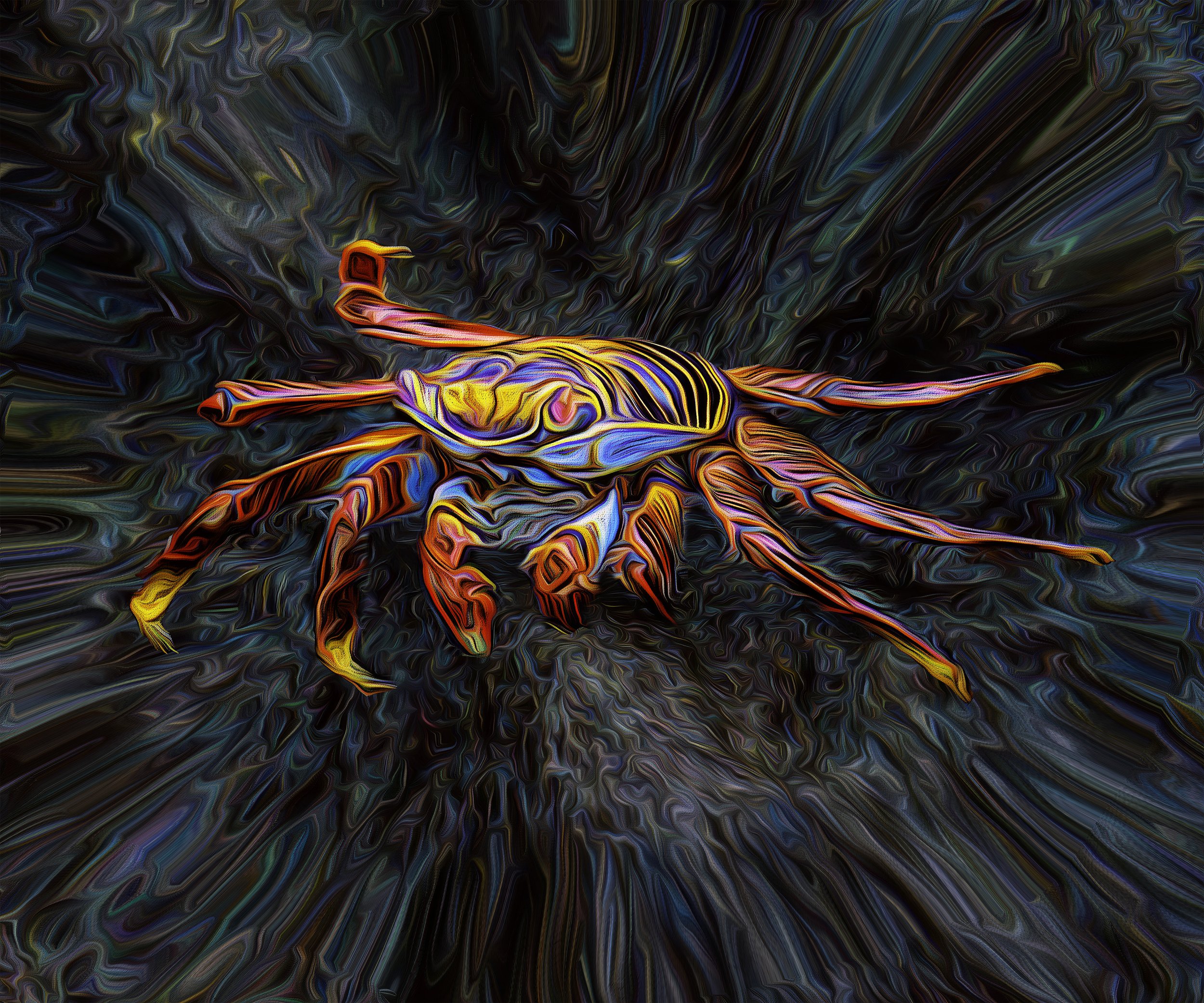
Cosmic Crab, 2025, Sublimation on Aluminum with Acrylic Overlay, 76x91 cm
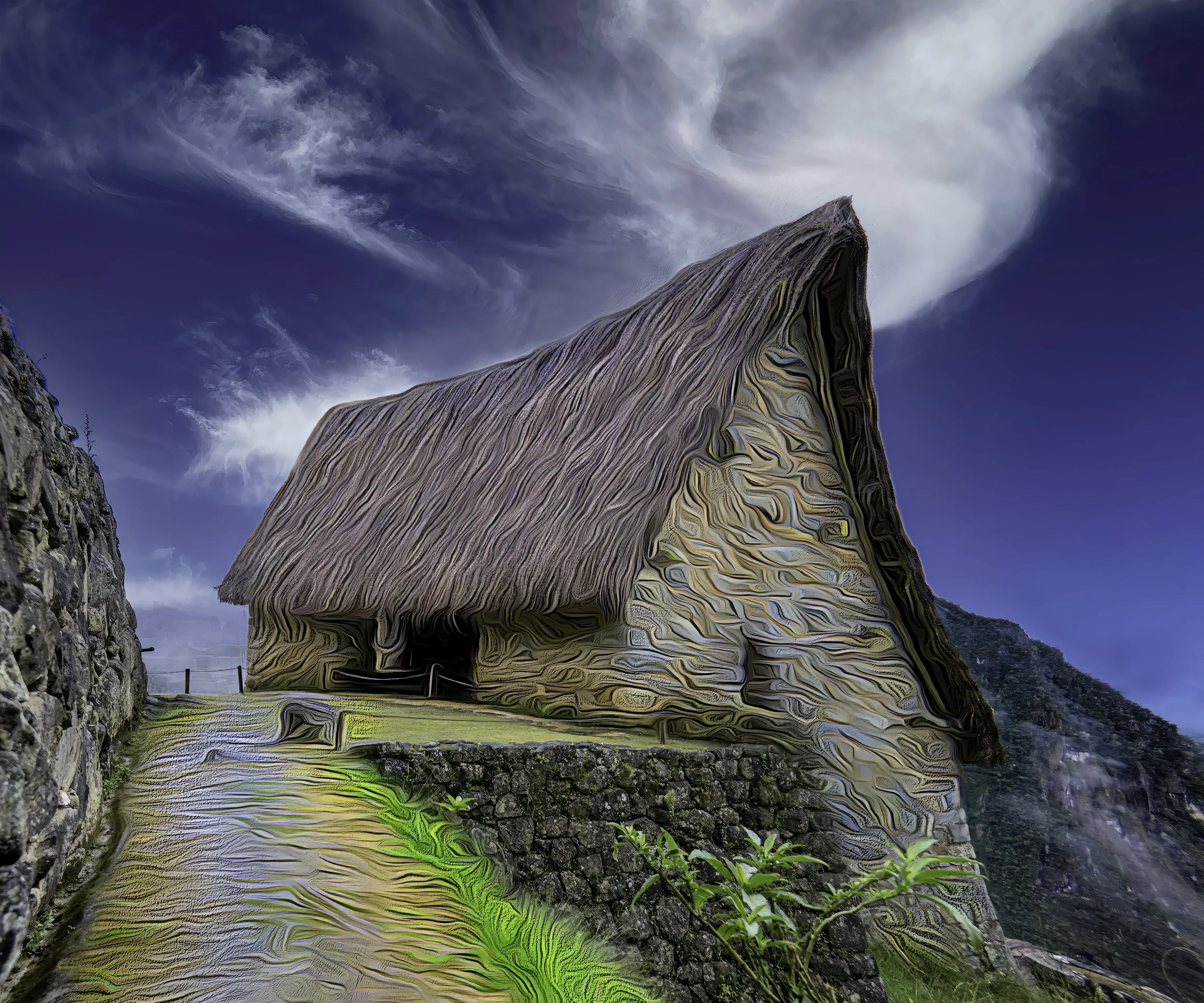
Slip Sliding Away, 2025, Sublimation on Aluminum with Acrylic Overlay, 76x91 cm
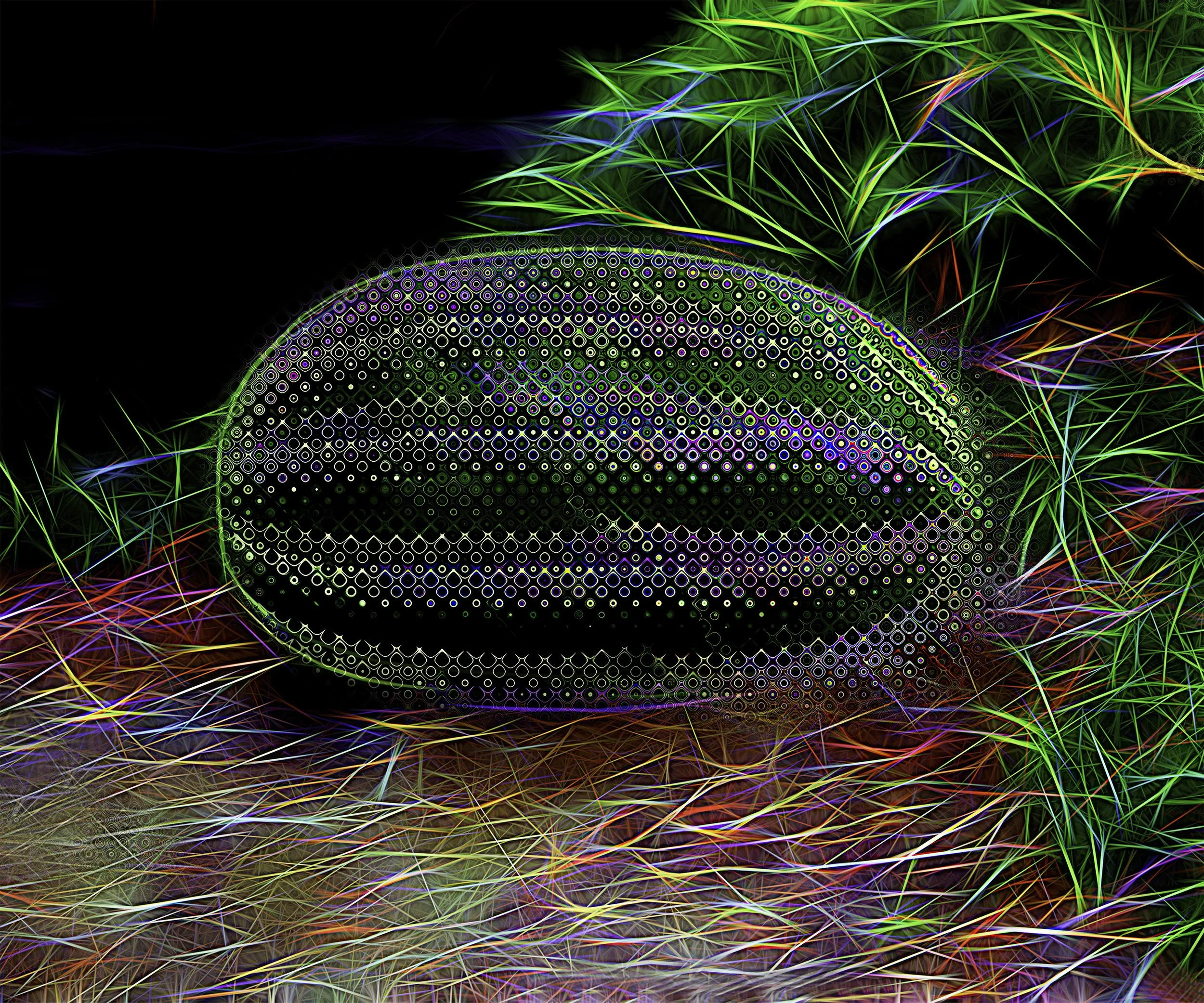
Water Mellon, 2019, Sublimation on Aluminum with Acrylic Overlay, 76x91 cm