
Valerie Meotti
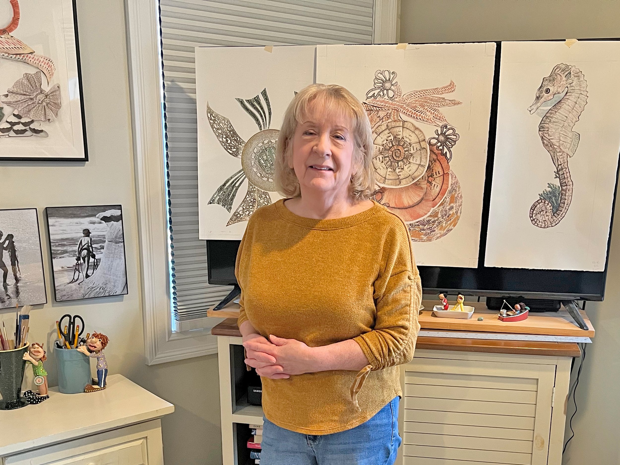
Valerie Meotti is a multidisciplinary artist whose work integrates watercolor, photography, and experimental digital processes influenced by traditional printmaking. She began creating watercolors and illustrations in their teen years and later entered the lithographic printing industry as an apprentice, gaining extensive experience in 4-color offset printing, color theory, retouching, photography, and early computer graphics. During this time, Valerie was exposed to leading contemporary artists through print work associated with United Limited Art Editions (ULAE), under the direction of Bill Goldston. Encounters with the work of Robert Rauschenberg, Jim Dine, and Larry Rivers—particularly Rauschenberg’s layered and process-driven approach—had a lasting influence on her artistic direction. Alongside a 35-year career as a professional graphic designer, Valerie developed a unique hybrid studio practice. Her current work combines original photography and painted elements into digital composites, which are printed in layers using archival Epson inks and transferred by hand onto high-quality watercolor paper. This labor-intensive process creates textured, painterly surfaces that reference traditional lithography while embracing chance and imperfection. Each piece is further refined with hand-applied watercolor, charcoal, pencil, and occasional collage. All works are produced as singular, one-of-a-kind originals.
Valerie, your recent work seems to occupy a charged threshold between the indexical trace of photography and the materially insistent surface of watercolor. Could you speak to the epistemological shift that occurred when you moved from painting what the eye had captured to constructing composite digital fields in Photoshop, and how this transition reoriented your understanding of authorship, vision, and mediation?
I was given an old Pentax camera by my grandmother who was a positive reinforcement of my talent and I loved to shoot pictures as subject matter. I used these pictures as reference for watercolor composition or at times created my own illustrative artwork from it. I was always the author of my creations and photography. It was later that I had the talent to merge them together. The shift you reference came when I mastered manipulating images in graphic software. I realized I could combine what I created with the brush and color and to manipulate my digital images with filtering and special effects to create a story rather than a static moment. My vision and mediation was to totally create my art as a one of a kind original composite but worked at it to express it visually. I started experimenting with paper stocks on my Canon printer and saw that if I printed on a glossy surface. There was a moment in drying time when it would transfer to another substrate. Not always predictable but at times magical. This is how it began.
Having begun in traditional watercolor and illustration, you now orchestrate a complex choreography of digital layering, inkjet printing, and manual transfer. In what ways does this hybrid procedure reconfigure the hierarchy between so called original and reproduction, particularly given that each of your works exists as a singular object born from a mechanically assisted process?
I have on my computer a layered image file of what I want to create but it is not a singular object. It is a file of many original visual original creations. It is true I cannot execute the art without my computer and printer. These are my transfer tools as well as my brush and paint. The “original” is the one final creation of my artwork. Considering the term mechanically assisted process; I was at the helm the whole time down to the final image. All artwork seems to be mechanically assisted by the artist even by their paint and brush but it is always theirs alone, an original. No other exists. They can be scanned and reproduced only as a reproduction. There are always new conditions that need to be reckoned with in my process. Mostly it’s my ability to be patient and try the transfer again until I am happy with the result. Not one of my original transfers can ever be exactly duplicated.
Your apprenticeship within the lithographic printing industry exposed you to the discipline of four color offset printing and the rigor of color separation. How has that early immersion in mechanical reproduction and chromatic calibration informed your current transfer process, especially in your deliberate embrace of misregistration, slippage, and surface irregularity?
I was apprenticed in an offset lithographic printing plant in the 70’s when I was 19 yrs old as a proofer and platemaker. In retrospect this was an education and experience that sent me into the most creative field I could imagine. I started making print plates one primary color at a time. Making color proofs one color at a time on a plastic base and layering them together in registration to see the final image. This graduated to combining negative composite flats called stripping in printing terms. A very labor intensive process of exactly registering negatives of design elements of each ink color to make a print plate to be mounted onto the press and then print in register. I also worked in the dark room assisting in color separations, filtering, and comping negatives to make the final print plates. This expanded over the years to meet the technological advances in computers of which there were many in printing. Registration was not one of them. It was now computer controlled. It now involved computer generated color proofing systems (color printers). I trained on the first professional graphic Scitex system which led to the creation of many graphic software programs that I trained on over the next 27 years. I never had to worry about my role in registration again so maybe it is the rebel in me wanting to see it in my art. Calibration was a must for proofing accurate art reproductions from computer to plate. It was difficult at times for a color separator to match in just 4 basic print colors of CMYK. Spot Pantone ink plates were often used in reproduction runs. In my using an inkjet printer It’s something I usually have to adjust but in addition I could always save by painting in pigment. I can’t say my registration or slippage is deliberate as it is difficult to do but ii is evaluated as I go.I try to work within surface irregularity to my advantage.
One senses in your layered composites an affinity with the procedural logic of printmaking, yet you resist editioning in favor of a unique outcome. How do you reconcile the reproducible matrix of the digital file with your insistence on the unrepeatable transfer, and does this tension constitute the conceptual core of the work?
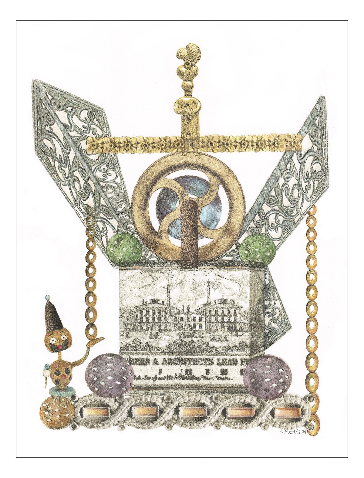
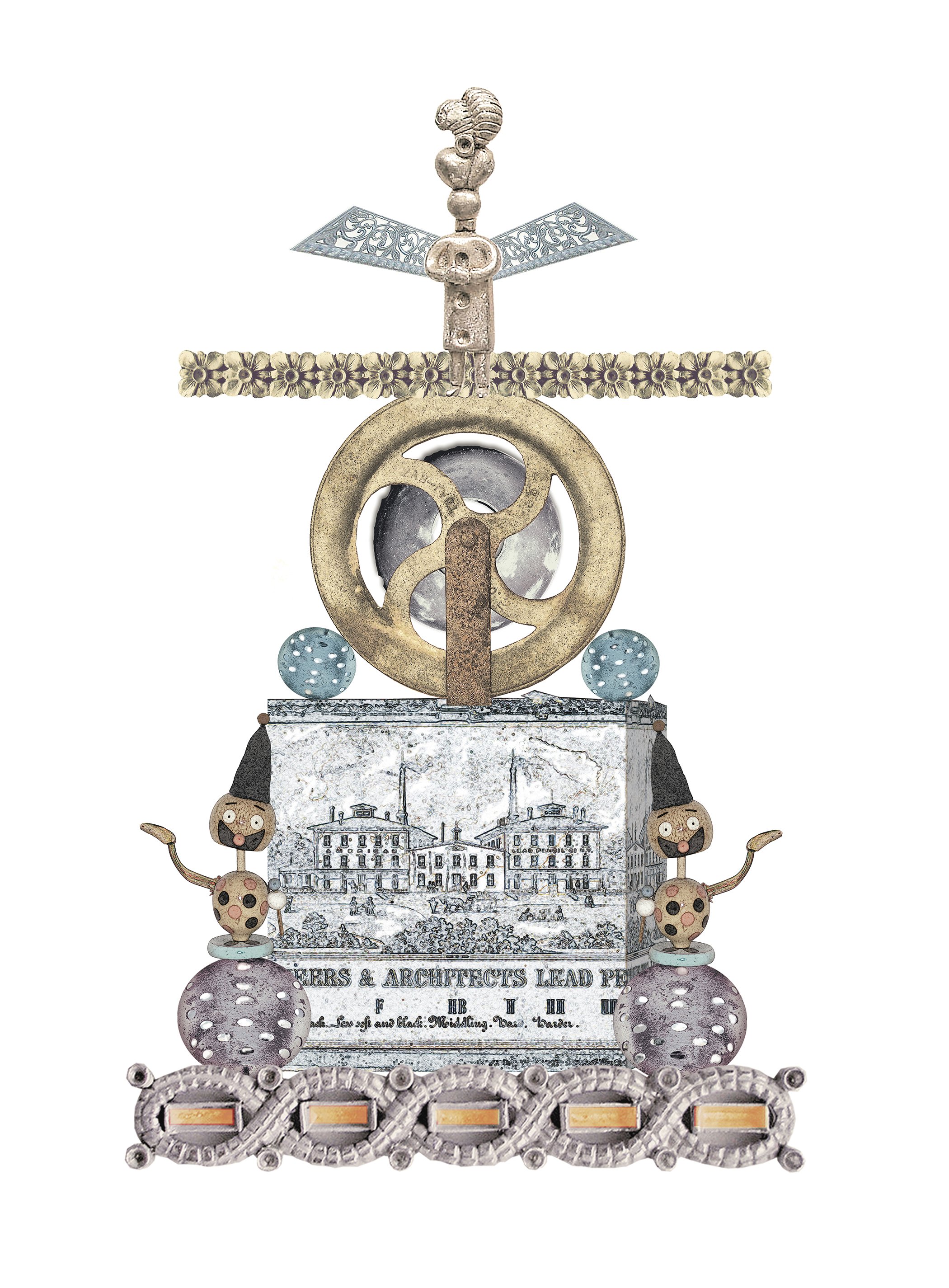
I am always in favor of unique outcomes and less tension. It makes it special and a pleasant surprise. Reproductions are all the same. Occasionally I do make an additional transfer copy if interest is shown. They are repeatable by me with some differences. I also have done a series of 4 works similar in nature called the “Engineers and Architects” series. Each uses the same or similar images but assembled in different design ways.Two of those were completed transfers and the other two were not. They were digitally printed onto art stock. It is hard to see the difference other than in design and paper stock. I managed to convey my desired filter effect with no transfer hence; less tension which does not happen often.
Your method of printing each layer in reverse onto glossy stock and transferring it by hand onto dampened watercolor paper introduces both control and contingency. Would you elaborate on how the risk of failure on a seventh or eighth pass functions not merely as a technical hazard but as a generative aesthetic principle?
Every artist tortures themselves creating. It’s the letting go of it that is the hardest. I would hardly stop a watercolor if I wasn’t happy with it but I could trash it once I was done if not pleased. Some pieces flow like water and others are like pulling teeth. I’ve learned to let go if I’m not happy with the outcome. So I guess it is on aesthetic principle. It doesn’t stop me from trying again so I consider that generative. I have to see some beauty in it.
The decision to transfer rather than simply print the digital composite seems to reassert the primacy of touch. Do you see this act as a form of resistance to the immateriality of the screen, or rather as a way of extending the digital image into a tactile, time laden object that carries the memory of its own making?
Absolutely, a perfect description. I need the image to show that it wasn’t just a one off. Sometimes it has been through a battle to survive. I want it to look tactile, worn, and familiar but vague. It needs to be explored. Interpreted for what it could possibly mean by the artist and the viewer. A transfer is a memory of a digital imprint that I put my painting technique towards.
In works such as Hotel California or Bombs Away, there appears to be a subtle negotiation between narrative suggestion and formal abstraction. How do you conceive of subject matter within your composites, particularly when found places and objects are sutured together with fragments of your painted past?
“Hotel California” is one of my favorite songs and this was one of my early works in composites. I spent time in California and the desert when I was younger and the song resonated with my past memories. This was comprised of free photo gatherings on the web and my photos trying to pull the lyrics together. If you were to look at the Photoshop composite before transfer you can see many areas that were altered on the fly of the transfer and of course my additions in watercolor changed it dramatically. My visualization of the lyrics to this song may be scattered but resonate with me.
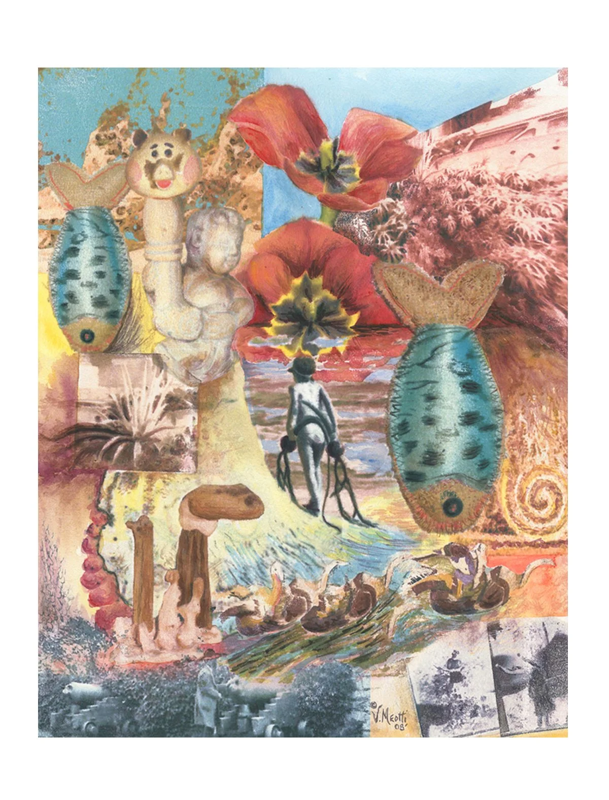
“Bombs Away” was created from my original photo collection. It symbolizes the loss of innocence and what you take away from it. The dropping fish symbolize destruction and the seaweed pods the girl is carrying into the sunset are intended to be what you take from past experiences and do not let go. The girl in center was from a series of four shots I took from the top of a cliff at the beach in La Jolla, Calif. I caught the images on my old Pentax Camera and have used the pictures in a few of my pieces. They are wonderful photographs of a young happy girl frolicking in the surf for some time with seaweed and then turning the corner of a cliff to go home with her new found friend which came in an unlikely form.
Your exposure to United Limited Art Editions and to figures such as Robert Rauschenberg, Jim Dine, Larry Rivers, and Jasper Johns undoubtedly shaped your sensibility. In what ways do you situate your practice in relation to Rauschenberg’s layered combines, especially in terms of process driven accretion and the collapse of medium specificity?
The process ULAE was using to create art was true Lithography at its core. Flat bed stone tablets hand etched by the artists then inked and pulled to dry before adding another element. This was the best of the best. Mr Rauschenberg had a huge library of photos and elements to incorporate into his art. He also had a troupe of mentors working on projects and learning from him. I went to see many of his exhibitions and had the honor to meet him and see the workings of the processes taken place at ULAE. It fueled my attention to the graphics of photography as well as layering, filtering and super imposing. Material textures, found objects and antiques with outdated usefulness seemed to accumulate. I was humbled and aspired to be a better artist every day. His practice of collecting images was my mission as well as creating sculpture and assemblages. My friend and coworker was an artist as well and we would collaborate on projects together. We saw new ways to incorporate cast-off press sheets out of the garbage bins into collage creations. We would cut the designs out of catalogs and sell-sheets and paste into designs, sometimes onto a structure. This moved me into sculpture and collage.
The surface of your transferred images often bears the marks of registration shifts and tonal variance. Rather than correcting these deviations, you elevate them as essential. Could you discuss how imperfection operates in your work as both a formal strategy and a philosophical stance toward control?
I think most art is a controlled evolution by the artist. A concept is explored, items added or taken away, changed in direction entirely. It is the creative process. Imperfections are natural. l have no control at times and not sure that is a strategy or just letting it be what it is. It’s been a survival tool that works for me on many levels. I would hate to pigeon hole my philosophical stance to control anything in my life.
Given your long career as a professional graphic designer, how do you negotiate the distinction between applied design, with its imperative toward clarity and precision, and your studio practice, which courts ambiguity and unpredictability? Does one discipline contaminate or liberate the other?
My design career navigated many different disciplines which aided me in my journey to finding my own voice and expression. My studio practices were developed over time utilizing what I had to work with. It was frustrating at times because I knew there was a better way to do it but I did not have access to the means to do it. So to be sure; not liberated from either practice. It’s a constant shift.
Your digital composites are constructed from your own photographs of found places and objects. How does the act of photographing function within your overall process: is it an act of collecting, of witnessing, or of extracting raw material for a later reconstitution that destabilizes the original referent?
The mental concept of a composite can be inspiration from anywhere. I will browse my photographs that I want to incorporate and visual items of interest that may relay a specific subject. I may already have a design I want to expand on or I will look for subject matter that has possibilities to shoot. I am a collector of found artifacts of interest or uniqueness in nature and in antique stores. I have built a library of images to draw from. I never feel destabilized when formulating a composite. It either works or it doesn’t in my overall design concept. It’s so easy to move layers around and change the balance, color and subject matter before I execute my transfer. Then the rest is up to me to culminate the image of my intent.
The transfer process introduces a temporal dimension, requiring stages of drying, alignment, and recalibration. How important is duration to the conceptual framework of the work, and might the slow accrual of layers be understood as a counterpoint to the instantaneous nature of digital production?
That is a very good question. The transfer process is nerve wracking at times. The printer may smudge or jam, the paper is too wet, too dry, image blurry, I forget to turn off or knock out an adjoining layer. Slow accrual is not a choice but a bad plan. The process takes concentration and a plan. The process is best done exactly rather than slowly. I just have to stay in my developed process zone. A straight digital reproduction looks lifeless. No soul so yes, a stark counterpoint from the transfer file with hand embellishments.
You have described your aim as blurring the boundaries between digital and traditional media. Do you perceive this blurring as a synthesis, a productive friction, or an unresolved tension that must remain visible in the finished piece?
I lean toward unresolved tension. I believe it’s important for some 'seams' to remain visible. By keeping that tension unresolved, the work reflects something imperfect. It draws the viewer in to examine the ‘why?’ Leaving the process visible allows the viewer to question the authenticity and origin of the marks they see as original and not manufactured.
The final embellishments in watercolor, charcoal, pencil, and occasional collage reintroduce gestural immediacy after the mechanical transfer. How do you determine when to intervene and when to withhold, and does this decision mark a return to your origins in watercolor or a transformation of that lineage?
Given the nature of the transfer as stark as it may be, I always intervene to clarify my intended design looking at balance, color and focal point. It’s also when I decide if it is good enough to pursue, modify my design or just start over. These avenues are always a consideration in any visually creative endeavor.
Your process recalls the logic of color separations and layered plates in lithography, yet the matrix is now virtual. How do you conceptualize the digital file: as a contemporary stone, as an invisible plate, or as something fundamentally different that alters the ontology of print?
It is simply a digital file of layered images arranged as a whole. It consists of many different digital based or pixilated images whether they be photographs or scans of painted images. I do not have to do color separations but can change any color channel if warranted. I am constrained by the size of transfer to fit sections on a letter size stock. Photoshop layers have to be organized and labeled as the image must be flipped horizontally to transfer correctly as my original design. Every transfer pass has to be calculated to fit or overlap another pass. This is a very important part of the process and can also pose difficulties in registration. Each layer has its own origin of creation and an artist’s hand in translating that to paper so it is fundamentally different from a mechanical print.
The fact that a work can collapse irreparably on a late transfer pass suggests a precariousness embedded in your practice. Do you experience this vulnerability as anxiety, as exhilaration, or as an ethical commitment to allowing chance to participate in authorship?
Total anxiety when it goes wrong, exhilaration when it goes right and always open for chance to step in and surprise me.
Your early Pistachio People, evolving from glued painted shells into ceramic and clay sculptures and illustrated books, introduce a playful, narrative dimension that contrasts with the more architectonic complexity of your transfers. How do these seemingly divergent bodies of work inform one another within your broader multidisciplinary identity?
They don’t really. I am a Gemini at heart. I have more than two sides to my creative works. Pistachio People were created when my children were very young. I looked at creative things more playfully then. The fragile nature of the shells inspired me to learn ceramics, buy a kiln and produce very collectable ceramic versions of my characters to sell. I lost my kiln and ceramic studio to Hurricane Sandy. Eventually this lead me to experiment with more unbreakable materials like plastic and paper clays. Another path explored and enjoyed.
In presenting the digital composite not as an end but as a stage within a longer analog transformation, you effectively displace the site of completion. At what point does the work declare itself finished, and how do you recognize that moment within such an open ended process?
The composite is the beginning and it takes some time to create. Before the transfer it is very familiar to me. There is a moment that can present itself when I identify that what I created digitally does not adhere to my process and the limitations it imposes. I must edit what I have done or put it aside as I may want to use one part of it for another project. If I already attempted a transfer on art paper, I abandoned it, I put it aside and look again at a later date. Rarely do I redeem it. I found in watercolor painting that you have to restrain from overworking and I find the same applies to my embellishments on transfers. I know as an artist that it’s done when I am happy to show it.
The archival inks and UV protective treatments you employ signal a concern with longevity. How do you reconcile this desire for durability with a process that foregrounds fragility, unpredictability, and the possibility of loss?
I can only speak from my experience to pieces I have created. Watercolor is in the same category of threat to (UV) damage if left in direct sun but never as bad as a 4-color printed reproductions that do not use archival inks. These were not introduced until the early 90’s. The term "archival" in printing became closely tied to "Giclée"prints. Now printer’s have the option to use archival inks on many different substrates. If making reproductions, the printer whether it is digital or litho (plate-based) know that there are UV safe archival options. Some of my own works that I have hanging in sun areas have a UV protected glass. The most expensive glass option. All in good condition. It all depends on how much sun is hitting it to damage. I have 3 pieces hanging in a hall with minimum natural light that are as vibrant as the day created. I also spray my finished works with a highly rated UV spray which also protects the embellished areas that is a bonus to the stable UV inks used from my printer. So far no loss has occurred. The lifespan for archival inks with UV protection is 100 yrs, 300 if stored.
In an era saturated with seamless digital imagery, your work insists on visible seams, layered accretions, and the trace of labor. Do you see your practice as a meditation on the contemporary image economy, and if so, what critical position do you hope it articulates within the discourse of contemporary art?
This is a compelling question these days with AI having so much control on society. It appears in every avenue of humanity and social media. I can respect an artist that creates drawings and composites with software tablets as “digital” works but AI generates on a whole new platform. The results are very entertaining and artistic but questions our individual creative futures. As my work reflects, I am not opposed to altering imaging to use in a different context but I want my work to reflect that it is human with emotion and errors in perfection. They are meant to tell a story however interpreted, not to question whether a program generated this from a worded description. I would hope artists keep their creativity alive by trying new ways to express themselves and let others see something that intrigues them to explore and wonder. The creative mind is a powerful force that is hard to duplicate.
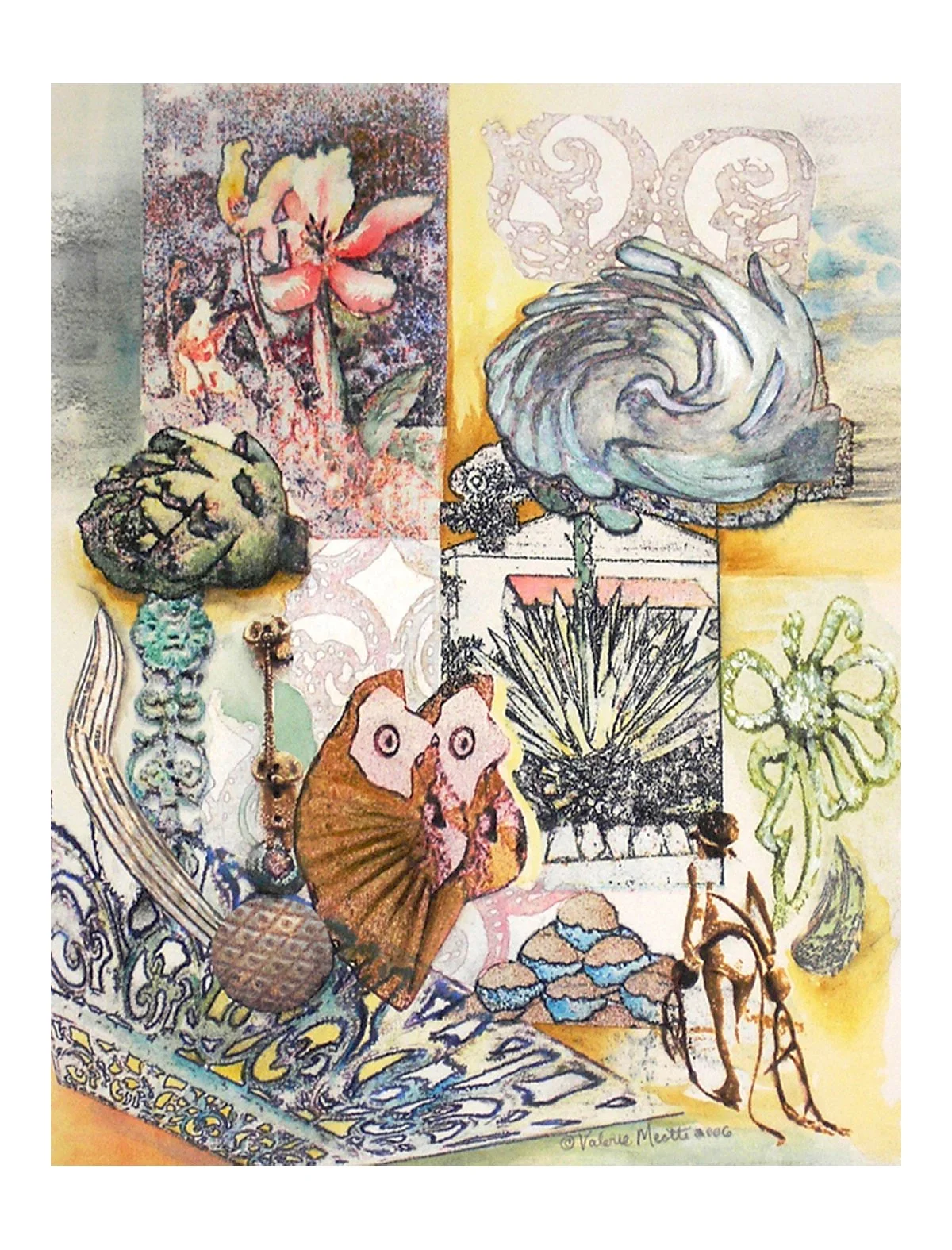
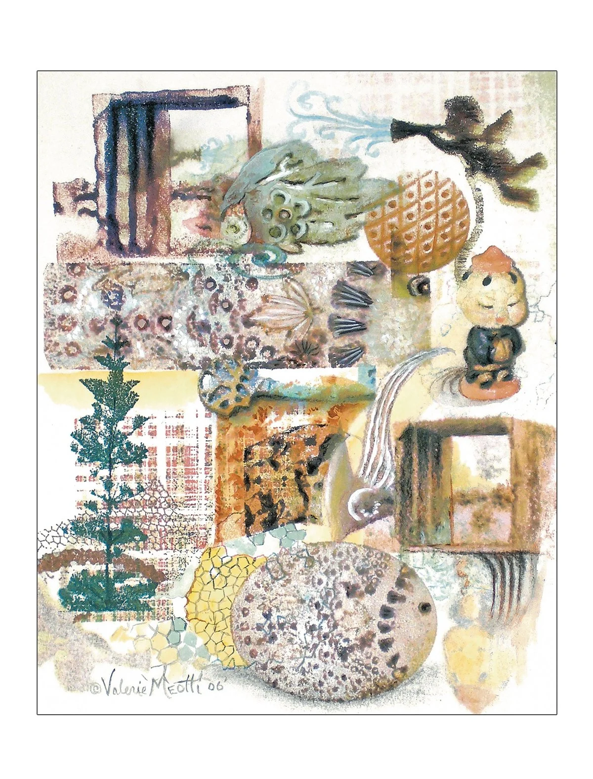
"Artichoke" 2006, Digital Transfer with watercolor (30.5cm x 40.7)
"Hotel California" 2012, Digital Transfer with watercolor (41 x 51 cm)
"Bombs Away" 2012, Digital Transfer with watercolor (41 x 51 cm)
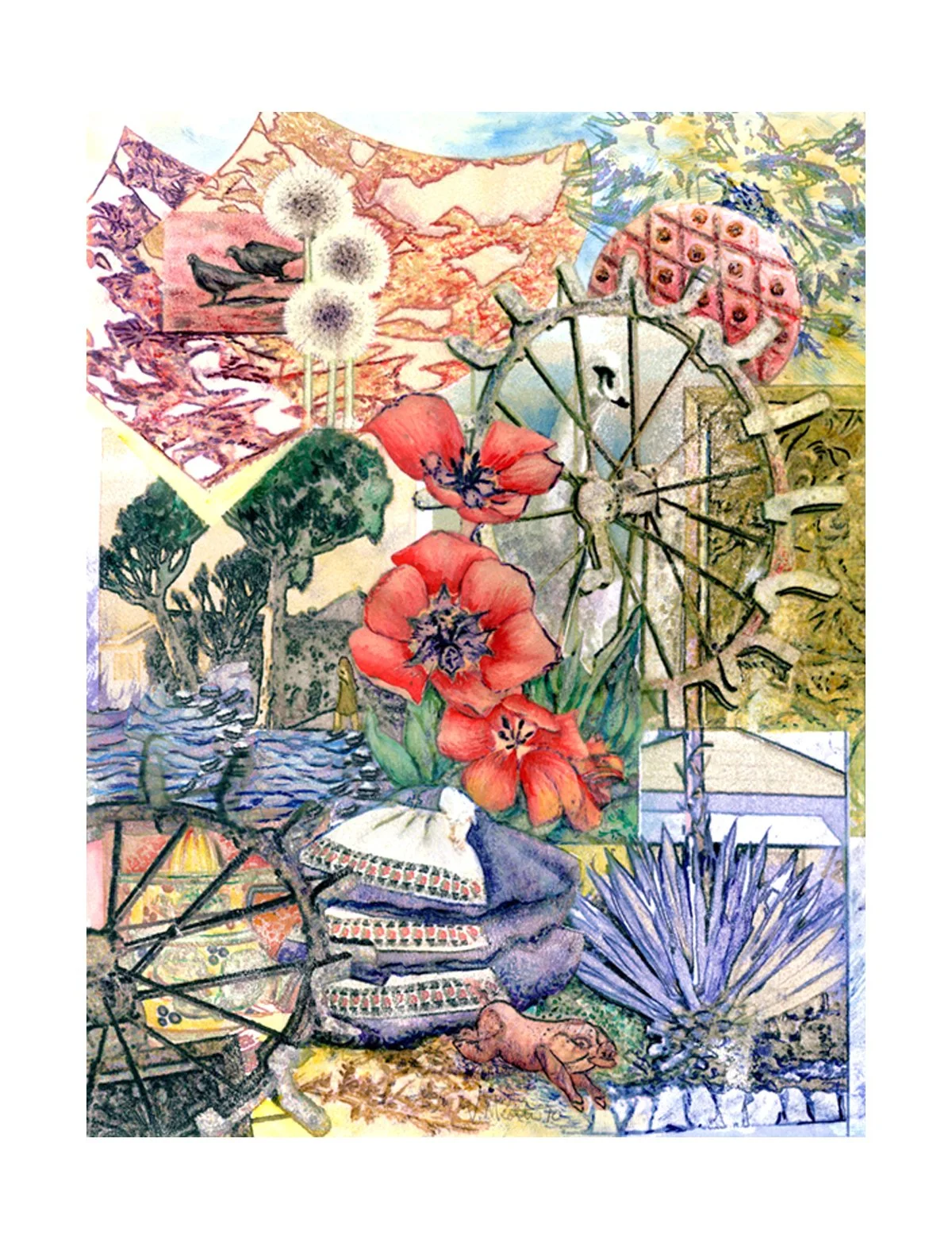
"Wheel me in" 2008, Digital Transfer with watercolor (41 x 51 cm)
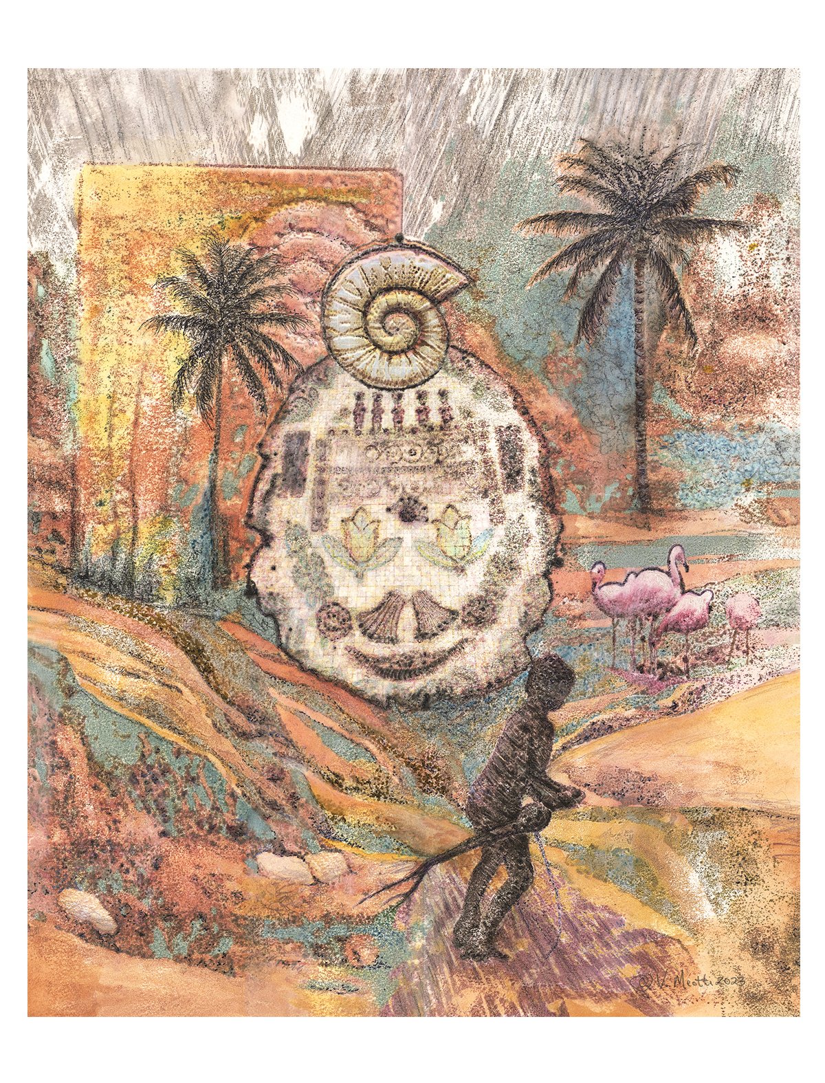
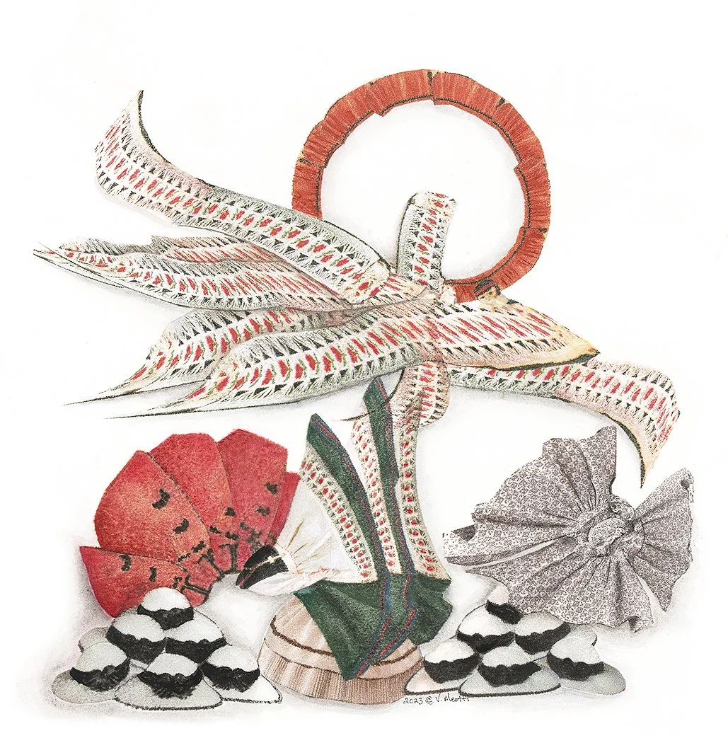
"Legend Slayer" 2023, Digital Transfer with watercolor (41 x 51 cm)
"Up and away" 2006, Digital Transfer with watercolor (46x 61 cm)
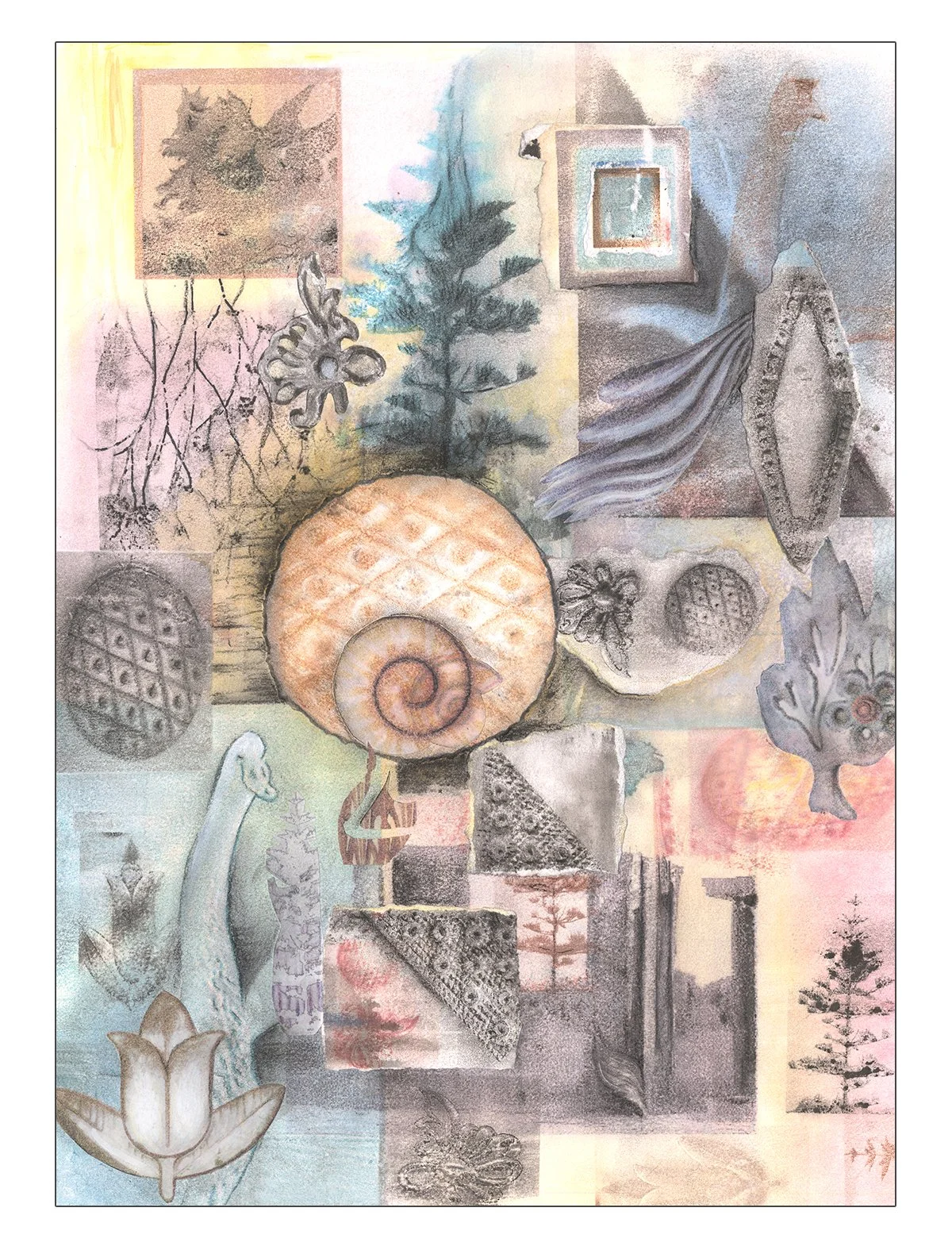
"Seasons" 2023, Digital Transfer with watercolor (41 x 51 cm)
"Go with the Flow" 2006, Digital Transfer with watercolor (25 x 33 cm)
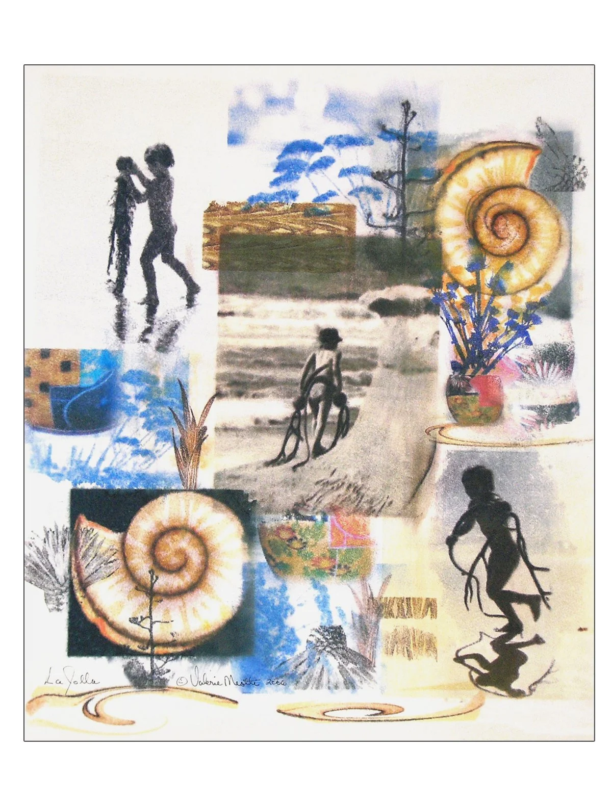
"LaJolla" 2009, Digital Transfer with watercolor (46 x 53 cm)
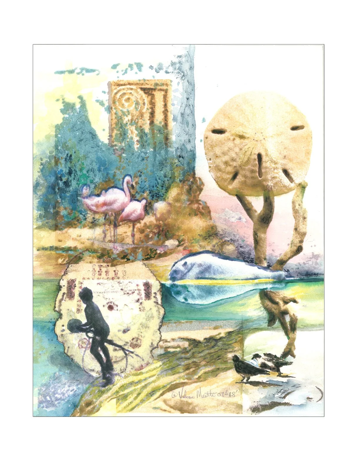
"Beach Envy" 2021, Digital Transfer with watercolor (25 x 33 cm)
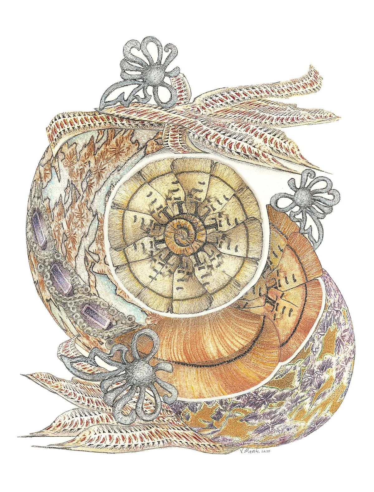
"Omega" 2024, Digital Transfer with watercolor (48 x 48 cm)
"Momentum" 2025, Digital Transfer with watercolor (41 x 51 cm)
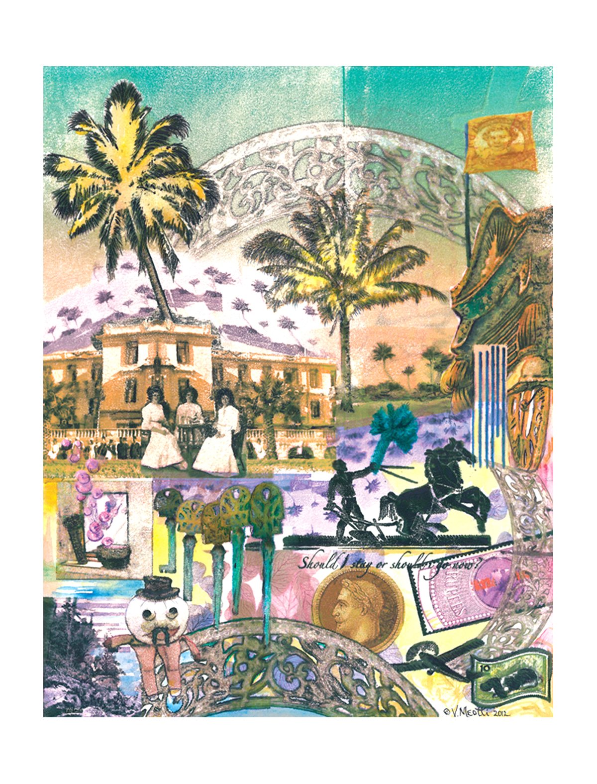
"Should I stay or go now?" 2025, Digital Transfer with watercolor (41 x 51 cm)
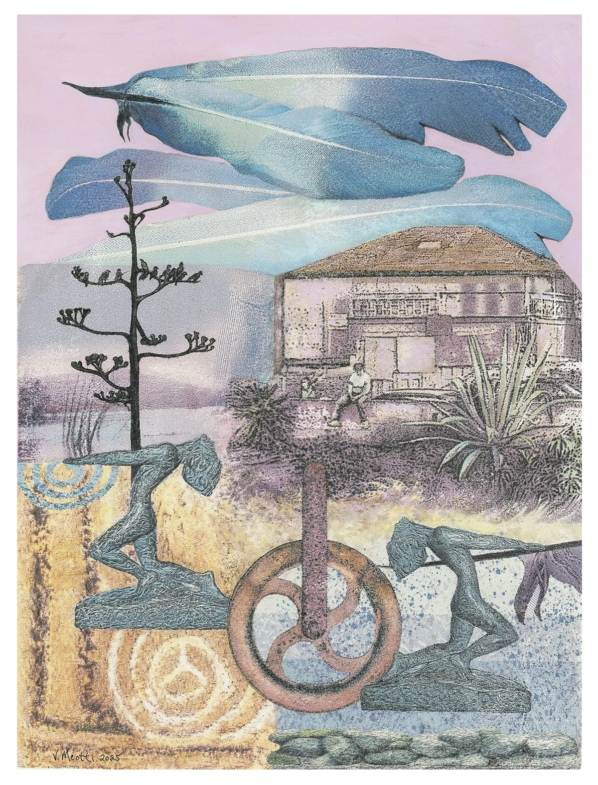
"Dream State" 2025, Digital Transfer with watercolor (41 x 51 cm)
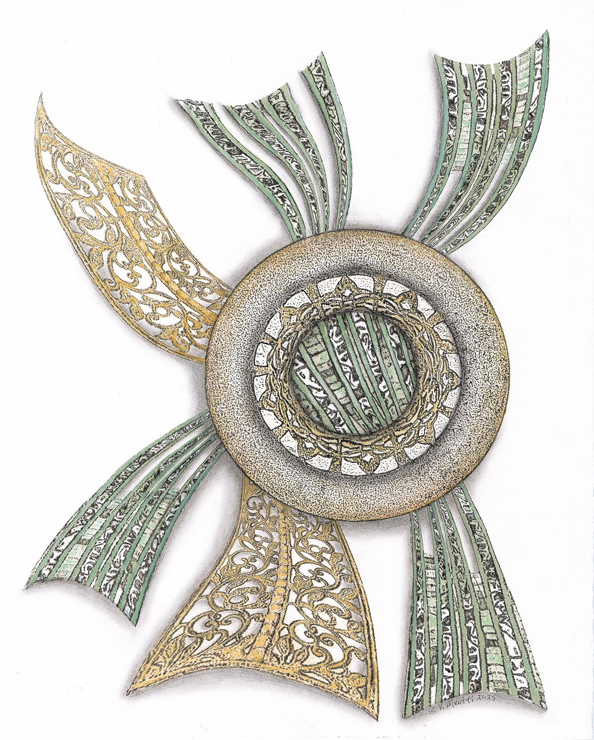
"Balance" 2025, Digital Transfer with watercolor (41 x 51 cm)
"Traction" 2025, Digital Transfer with watercolor (41 x 51 cm)
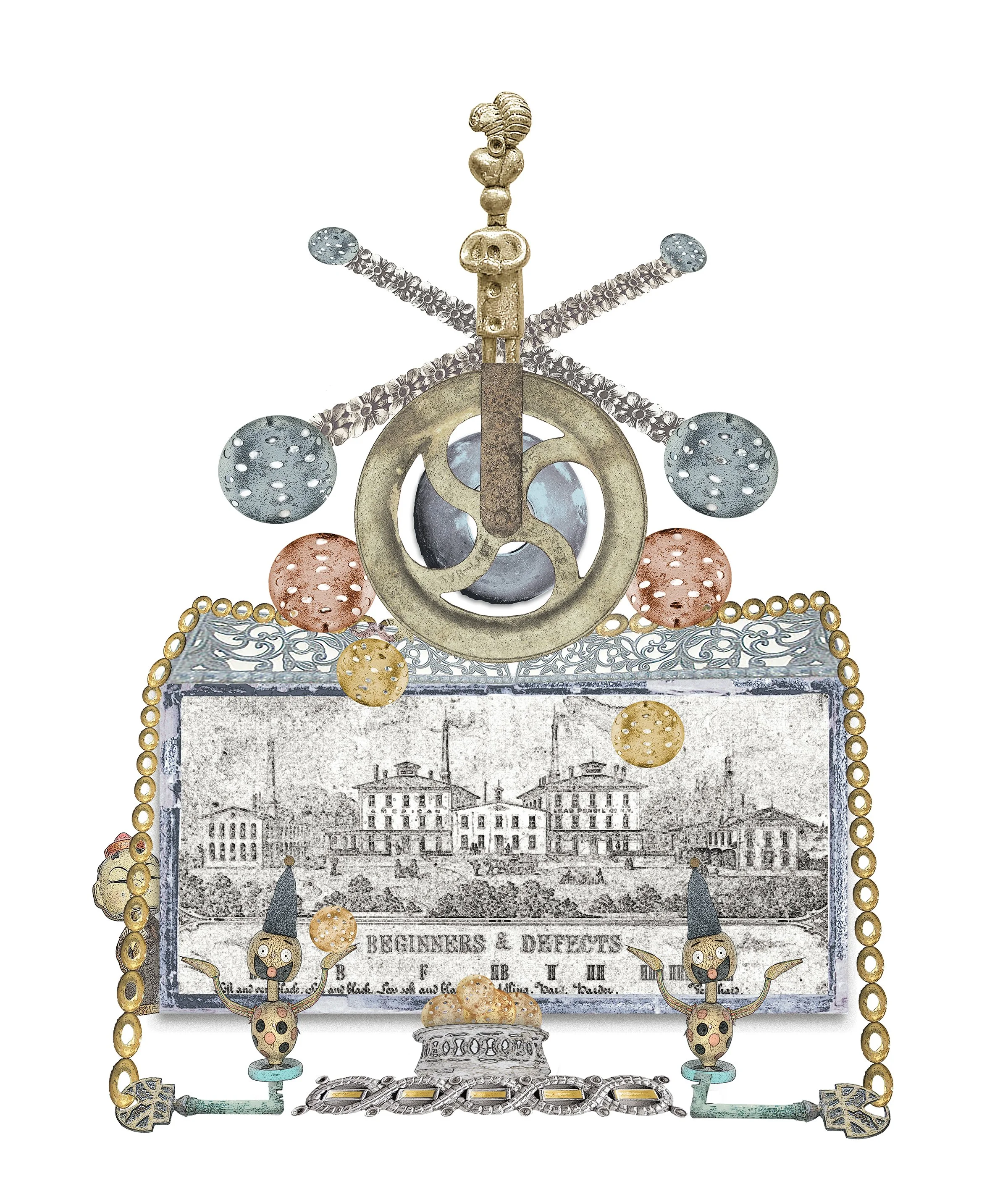
"Beginners and Defects" 2025, Digital Composite (41 x 51 cm)
"King of the World" 2025 Digital Composite (41 x 51 cm)
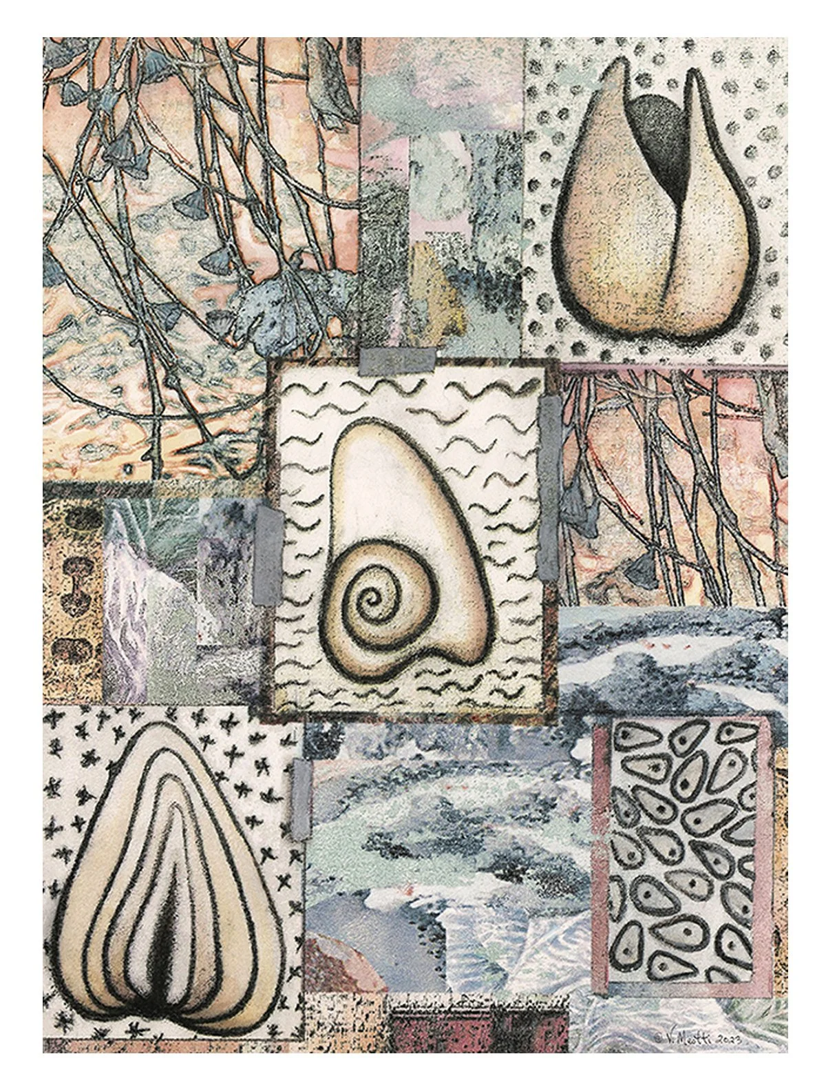
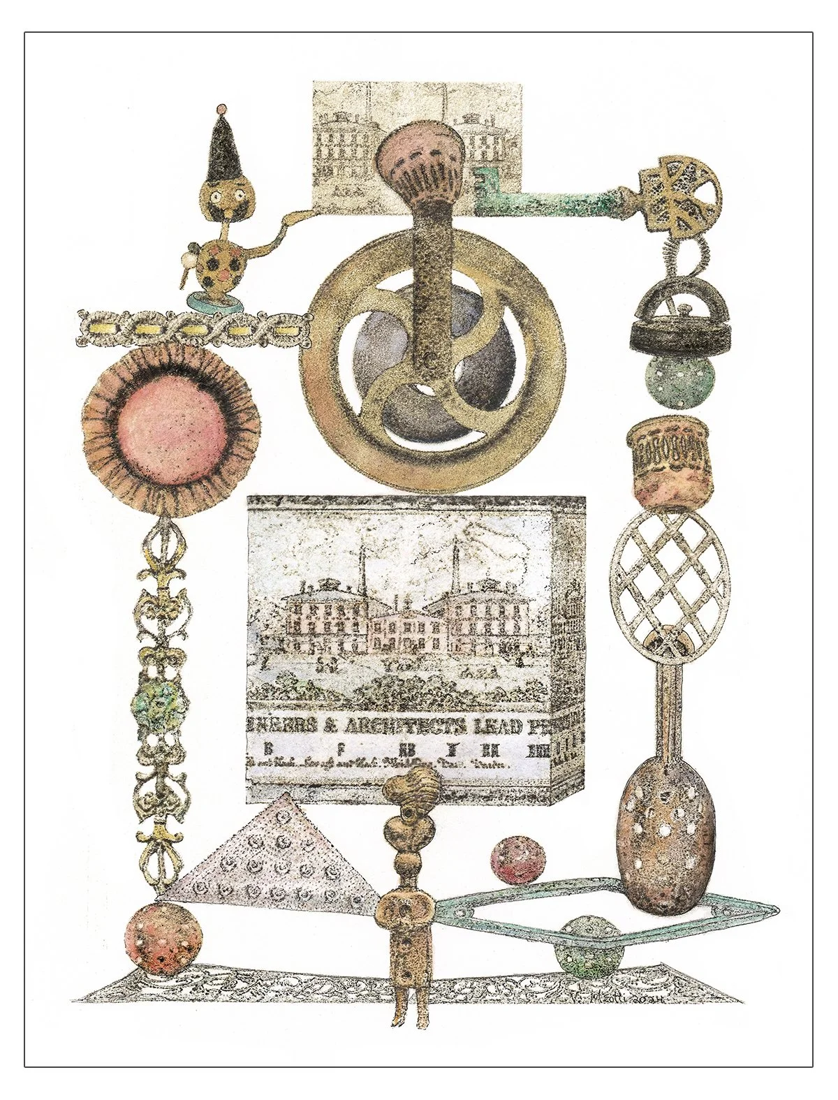
"Antiquities" 2019 Digital Transfer with Watercolor (51 x 41 cm)
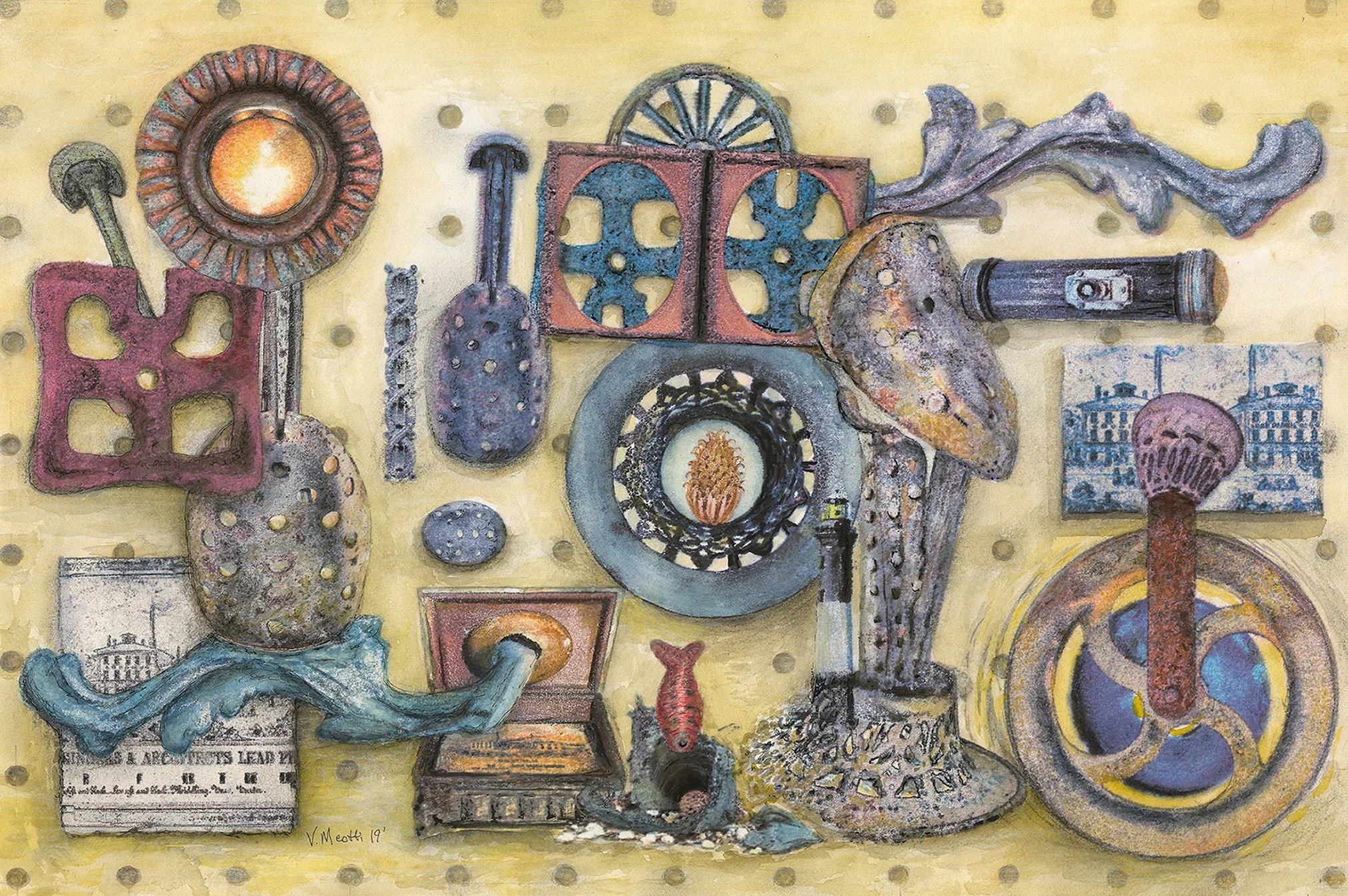
Antiquities Transfer Process, Multiple stages 2026